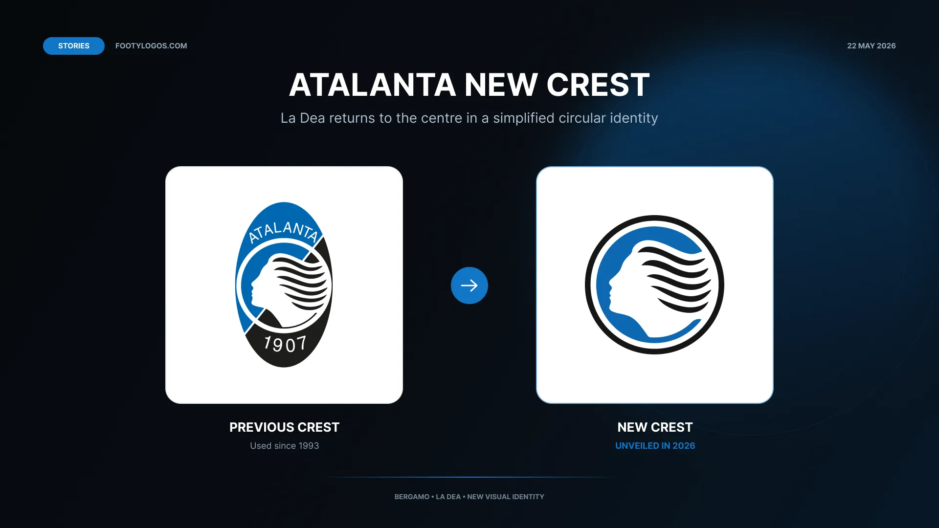
The redesigned logo removes the oval structure, club name and “1907” text used in the previous crest, placing the white profile of La Dea at the centre of a blue circular background enclosed by a black ring. Atalanta presented the update on the second anniversary of their UEFA Europa League victory, describing it as an evolution of the club’s identity designed to combine tradition with greater recognisability.
The new badge replaces the oval crest introduced in 1993 and revives the circular direction associated with Atalanta’s identity during the 1980s.
What has changed in the new Atalanta logo?
The previous Atalanta crest was an elongated oval containing the profile of La Dea inside a central circle, set against a divided blue and black background. The name “ATALANTA” appeared above the figure, with the founding year “1907” below.
The new design strips the badge back to its central symbol. La Dea now occupies the crest without surrounding lettering or additional internal elements. The background is entirely blue, while a black circular outline replaces the former oval shape and two-tone outer field.
Atalanta explained that the new crest was developed through a principle of subtraction: removing secondary elements to give greater prominence to La Dea and make the club symbol immediately identifiable across different applications.
Why La Dea remains central to Atalanta’s identity
La Dea, meaning “The Goddess”, refers to Atalanta, the figure from Greek mythology whose name was adopted by the club. Her silhouette first appeared in Atalanta’s crest during the 1960s and has remained its defining visual symbol through subsequent badge redesigns.
For the 2026 update, the club retained the profile of La Dea while redrawing it through a more geometric construction. One of the new crest’s most specific historical references appears in her hair: the design uses five strands, deliberately representing the five founders who established Atalanta in 1907.
The result is a badge focused entirely on the figure most closely associated with the club, rather than on surrounding typography or a more detailed shield composition.
A circular crest inspired by Atalanta’s 1980s badge
Atalanta stated that the new logo draws inspiration from the circular badge introduced during the 1980s. That earlier identity also placed the profile of La Dea inside a round emblem, before the club moved to the oval crest used from 1993 until the 2026 redesign.
The new version is not a direct recreation of the historic circular badge. Instead, it uses a cleaner construction, an entirely blue background and a black outer circle, creating a simplified contemporary identity while retaining the club’s established symbol.
By returning to a circular form, Atalanta have moved away from the oval badge associated with the previous three decades and reconnected the club’s visual identity with an earlier period of its crest history.
Why Atalanta changed their crest
In its official presentation, Atalanta described the new crest as part of an evolution of the club’s identity, intended to strengthen recognition of the Atalanta brand while preserving its connection with Bergamo and its supporters.
The design and creative development were carried out by Pernice Comunicazione, Atalanta’s exclusive communication studio. The agency described the change as a return to essential lines and colours, with greater balance, simplicity and recognisability.
Club president Antonio Percassi linked the redesign to Atalanta’s history and Bergamasque identity, while CEO Luca Percassi emphasised the clarity and distinctiveness of the profile of La Dea. The club’s explanation therefore positions the new logo as a modernisation centred on an established historic symbol rather than a departure from its identity.
When was the new Atalanta logo unveiled?
Atalanta officially presented the new crest on Friday, 22 May 2026. The unveiling took place on the second anniversary of the club’s UEFA Europa League final victory over Bayer Leverkusen in Dublin on 22 May 2024.
To accompany the launch, the Atalanta Store Bergamo Centro displayed both historic club crests and the new badge during a dedicated weekend initiative. The presentation connected the new identity with the wider history of Atalanta’s logos and the club’s most significant recent sporting achievement.
Atalanta new logo timeline
- 1960s: The silhouette of La Dea first appears in Atalanta’s club crest.
- 1980s: Atalanta introduce a circular crest centred on the profile of La Dea.
- 1993: The club introduces the oval badge featuring the Atalanta name, the founding year 1907 and La Dea within a blue-and-black composition.
- 22 May 2024: Atalanta win the UEFA Europa League, defeating Bayer Leverkusen in Dublin.
- 22 May 2026: Atalanta unveil their new circular crest on the second anniversary of their Europa League triumph.
Download the new Atalanta logo
Download the up-to-date Atalanta logo in SVG and PNG formats on FootyLogos, with transparent-background crest files available for editorial and reference use.
Sources
- Atalanta BC, “La Dea Back in the Spotlight”, published 22 May 2026.
- Atalanta BC, “The new Atalanta crest, the executive statements”, published 22 May 2026.
- Atalanta BC, “Celebrating the new crest at the Atalanta Store Bergamo Centro”, published 22 May 2026.
- L’Eco di Bergamo, “Il nuovo logo dell’Atalanta: la Dea al centro”, published 22 May 2026.