


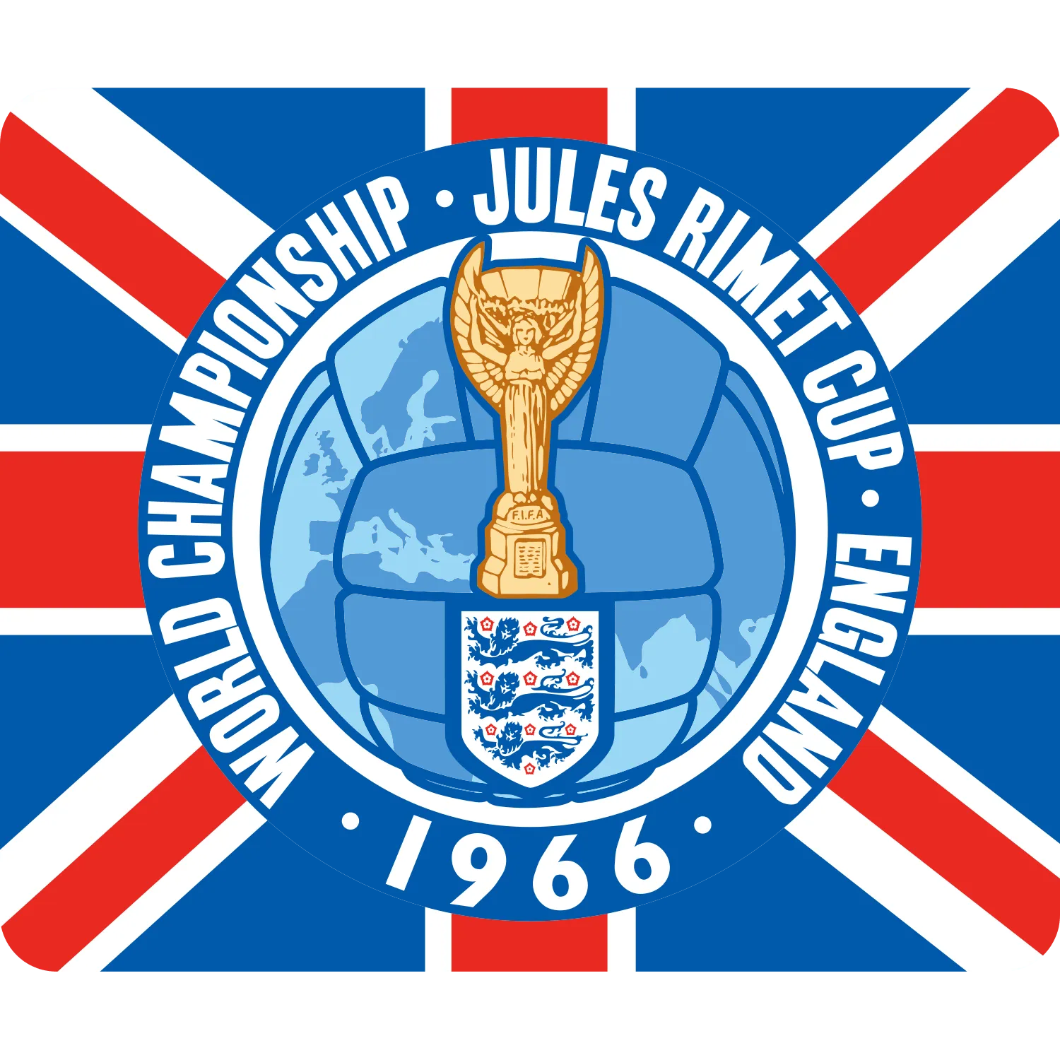


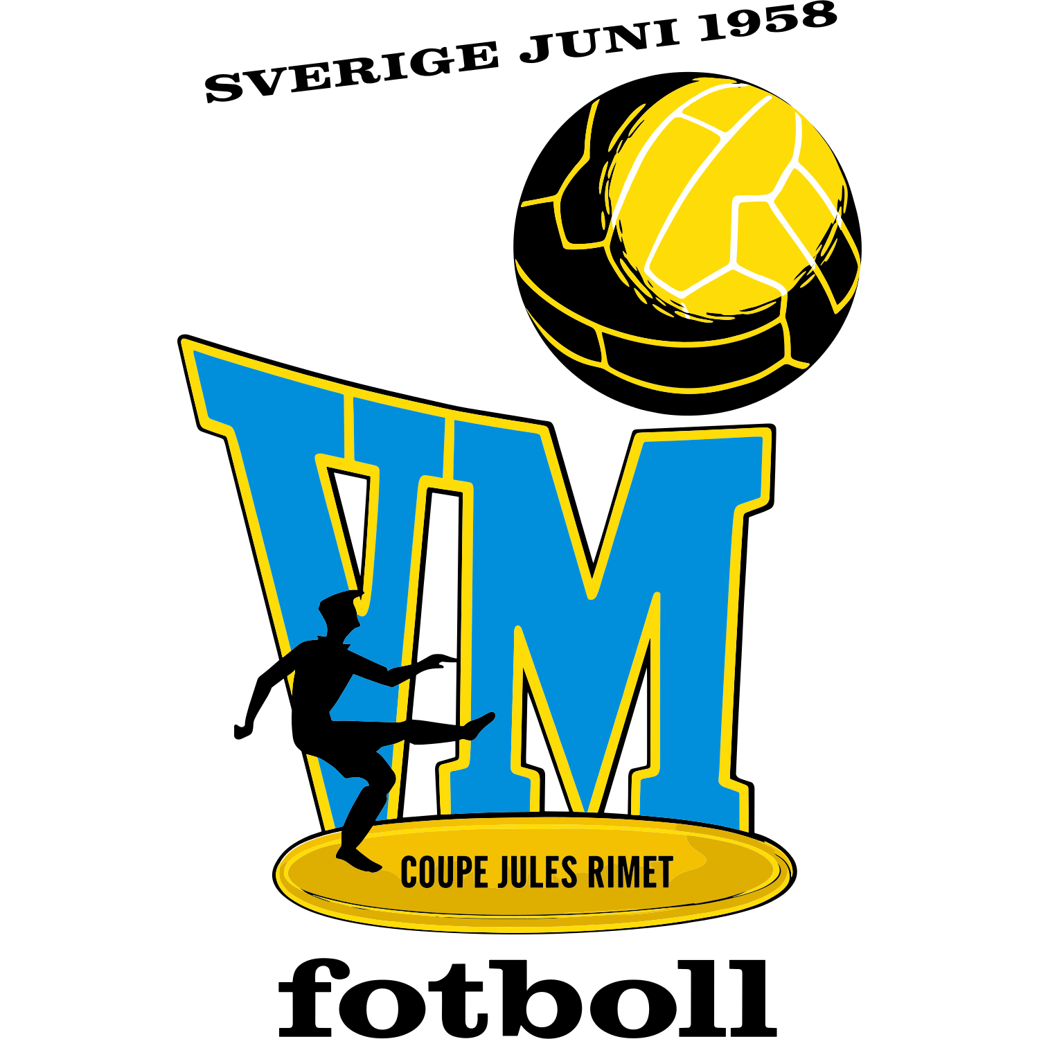

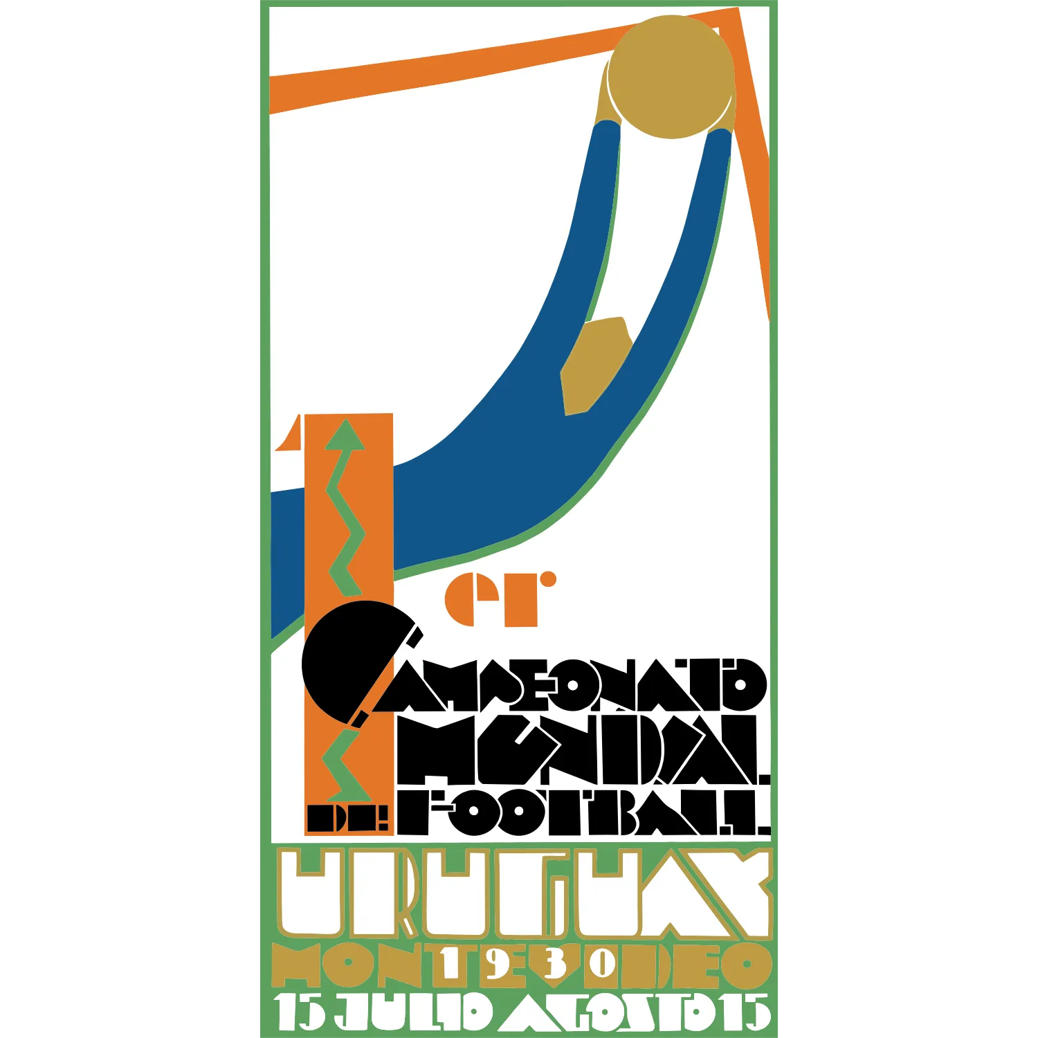


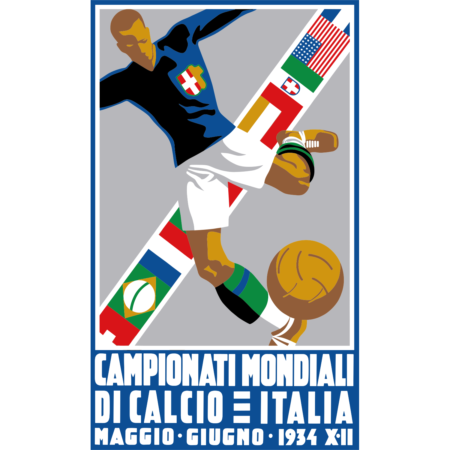
The FIFA World Cup is the most iconic tournament in global football, organized every four years by FIFA. Since its first edition in 1930, each tournament has introduced a unique official emblem that reflects the host nation’s culture, design trends of the era, and the global identity of the competition.
FIFA World Cup edition logos have evolved significantly over time—from simple typographic marks and poster-style illustrations in the early years to highly refined, symbolic identities in modern tournaments. Classic designs like Mexico 1970 and Italy 1990 emphasized bold geometry and national colors, while more recent editions such as Brazil 2014 and Qatar 2022 incorporate storytelling elements, cultural symbolism, and digital-friendly design systems. Despite these stylistic changes, most logos maintain core themes such as the trophy, the globe, or human figures, reinforcing the tournament’s universal appeal.
These logos are not only visual identifiers but also historical markers of each World Cup era, capturing shifts in graphic design, branding, and international football culture. Collecting and comparing them offers a unique perspective on how the world’s biggest sporting event has been visually represented across decades.