


About the Paris Saint-Germain (PSG) logo: meaning, evolution and facts
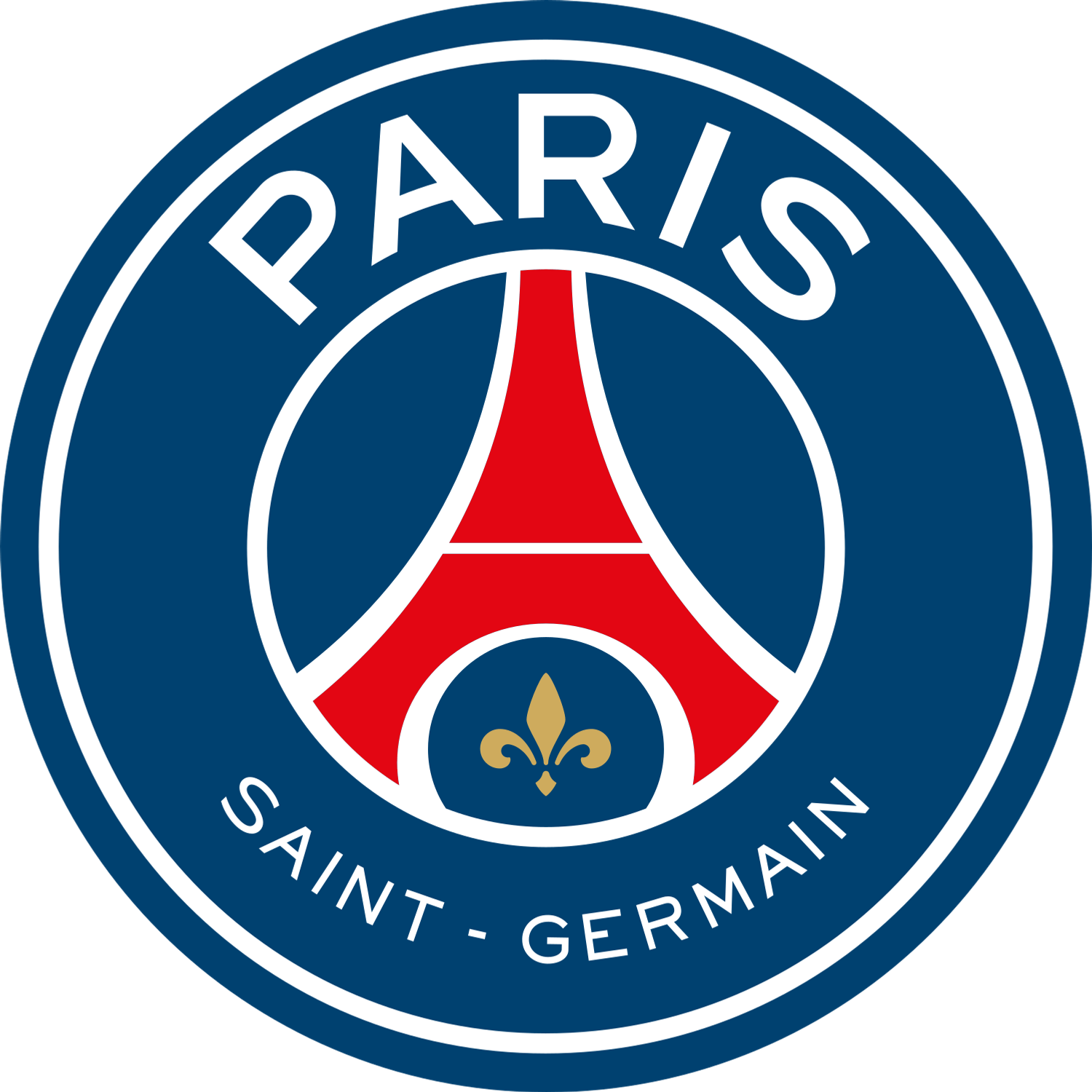
The Paris Saint-Germain logo is a circular crest built around a deep blue background, featuring a red Eiffel Tower at its centre and a gold fleur-de-lis beneath it, surrounded by the club name “Paris Saint-Germain” in white lettering. This clean, geometric composition is designed for clarity and instant recognition, combining strong vertical symbolism (the tower) with a balanced circular structure that frames the identity.
What makes the PSG badge unique among major European clubs is its direct association with a globally recognisable monument. Rather than relying on abstract heraldry or mascots, the crest is anchored in Parisian identity. The design blends civic symbolism with modern branding: bold shapes, limited colour palette, and high legibility across kits, media, and merchandising.
Today, the logo is used consistently across all official applications, from match kits to digital platforms. While some fashion or lifestyle collections may experiment with simplified versions—often focusing on the Eiffel Tower—the full circular badge remains the core visual identity of the club.
Origins of the PSG crest
Paris Saint-Germain was founded in 1970 following the merger of Paris FC and Stade Saint-Germain. The club’s first crest (1970–1972) did not feature the Eiffel Tower. Instead, it was inherited from Paris FC and showed a blue football with a red sailing ship, a historic symbol taken from the coat of arms of Paris.
This ship symbol (“la nef”) represents the city’s long-standing association with trade and river navigation, and is still present in Paris’ official emblem today.
In 1972, after the split from Paris FC, PSG introduced a completely new crest that established the foundations of its modern identity. Designed by Christian Lentretien, it featured a red Eiffel Tower on a blue background, along with symbols of Saint-Germain-en-Laye: a cradle and a fleur-de-lis.
This 1972 design marked the true birth of PSG’s visual identity, combining the imagery of Paris and Saint-Germain into a single, cohesive badge.
What the symbols on the Paris Saint-Germain badge represent
The Eiffel Tower
Origin: Landmark of Paris
Meaning:
Introduced in 1972, the Eiffel Tower represents the city of Paris and anchors the club’s identity as the capital’s main football institution. Its central position reinforces PSG’s ambition to embody Paris on a global stage.
The fleur-de-lis
Origin: French royal symbol, linked to Saint-Germain-en-Laye
Meaning:
The fleur-de-lis references the historical identity of Saint-Germain-en-Laye, the birthplace of King Louis XIV. It connects the club to French royal heritage and complements the Parisian symbolism of the tower.
The cradle (historical element)
Origin: Birthplace of Louis XIV
Meaning:
Originally placed beneath the Eiffel Tower, the cradle symbolised the royal birth in Saint-Germain-en-Laye. It was removed in the 2013 redesign to simplify the crest and improve global readability.
The sailing ship (early crest only)
Origin: Coat of arms of Paris
Meaning:
Used in the 1970–1972 crest, the ship represented the city of Paris and its historical motto. It was dropped when PSG adopted its own independent identity after separating from Paris FC.
The circular badge
Origin: Modern sports branding
Meaning:
The circular format allows the club name to frame the central symbols clearly, improving legibility and adaptability across different media.
Evolution of the PSG crest
- 1970–1972 – Paris FC-derived crest
A blue football with a red sailing ship symbolised Paris. This was a transitional identity inherited from Paris FC, not yet a distinct PSG brand. - 1972–1982 – Birth of the Eiffel Tower crest
Introduction of the iconic red Eiffel Tower on blue background, with cradle and fleur-de-lis. This design established PSG’s long-term visual identity. - 1982–1990 – Parc des Princes variation
The club briefly incorporated a stylised representation of the Parc des Princes stadium into the badge, adding architectural detail while keeping the tower. - 1990–1992 – Return to classic tower crest
PSG reverted to the simpler Eiffel Tower design without the stadium element. - 1992–1996 – Radical “PSG” wordmark era
A complete redesign replaced the tower with a graphic logo featuring the letters “PSG.” The change was unpopular with supporters and short-lived. - 1996–2002 – Return to traditional crest
The Eiffel Tower, cradle, and fleur-de-lis returned, now framed in a circular badge with the club name and the founding year “1970.” - 2002–2013 – Refined modern crest
Minor adjustments improved colours and clarity while keeping the same structure. - 2013–present – Contemporary global identity
A major redesign enlarged “Paris,” reduced “Saint-Germain,” removed the cradle, and simplified the overall design to strengthen global branding.
Colors and typography
PSG’s visual identity is built on a strong, consistent palette:
- Blue: Primary background colour, representing Paris and forming the base of the club’s identity
- Red: Used for the Eiffel Tower, reinforcing visibility and echoing the club’s kit design
- White: Ensures high contrast and readability for the club name
- Gold: Used for the fleur-de-lis, highlighting heritage and adding visual distinction
The typography is a clean, uppercase sans-serif arranged in a circular format. This modern lettering enhances clarity and scalability, particularly in digital environments and global merchandising.
Logo-related trivia for fans
- The Eiffel Tower only appeared from 1972 onwards, not in the original 1970 crest.
- PSG’s first logo was directly inherited from Paris FC, explaining the use of the ship symbol.
- The cradle of Louis XIV remained part of the crest for decades before being removed in 2013.
- The 1992–1996 logo abandoned the Eiffel Tower entirely, making it the most radical departure in the club’s visual history.
- The Parc des Princes stadium briefly appeared on the crest in the 1980s, a rare feature in football badge design.
- The 2013 redesign intentionally emphasized “Paris” as the primary brand, reflecting global ambitions.
- The crest has remained circular for most of its history, reinforcing consistency across decades.
The Paris Saint-Germain logo stands as a clear example of identity built around place. By combining the Eiffel Tower with symbols of Saint-Germain-en-Laye, the club has created a crest that reflects both its origins and its ambition.
Rather than constantly reinventing its image, PSG has refined a strong core concept since 1972, adapting it for modern branding while preserving its key elements. This balance between heritage and clarity has made the PSG badge one of the most recognisable symbols in world football.
--
About Paris Saint-Germain — Paris Saint-Germain is a professional football club from France competing in Ligue 1. This page provides the primary crest and social media icon (SVG & PNG) with transparent backgrounds for editorial/reference use. For official brand rules, consult the club’s official site. Paris Saint-Germain crest and related marks are trademarks of their respective owners; high‑quality logo files are provided above on this page.


