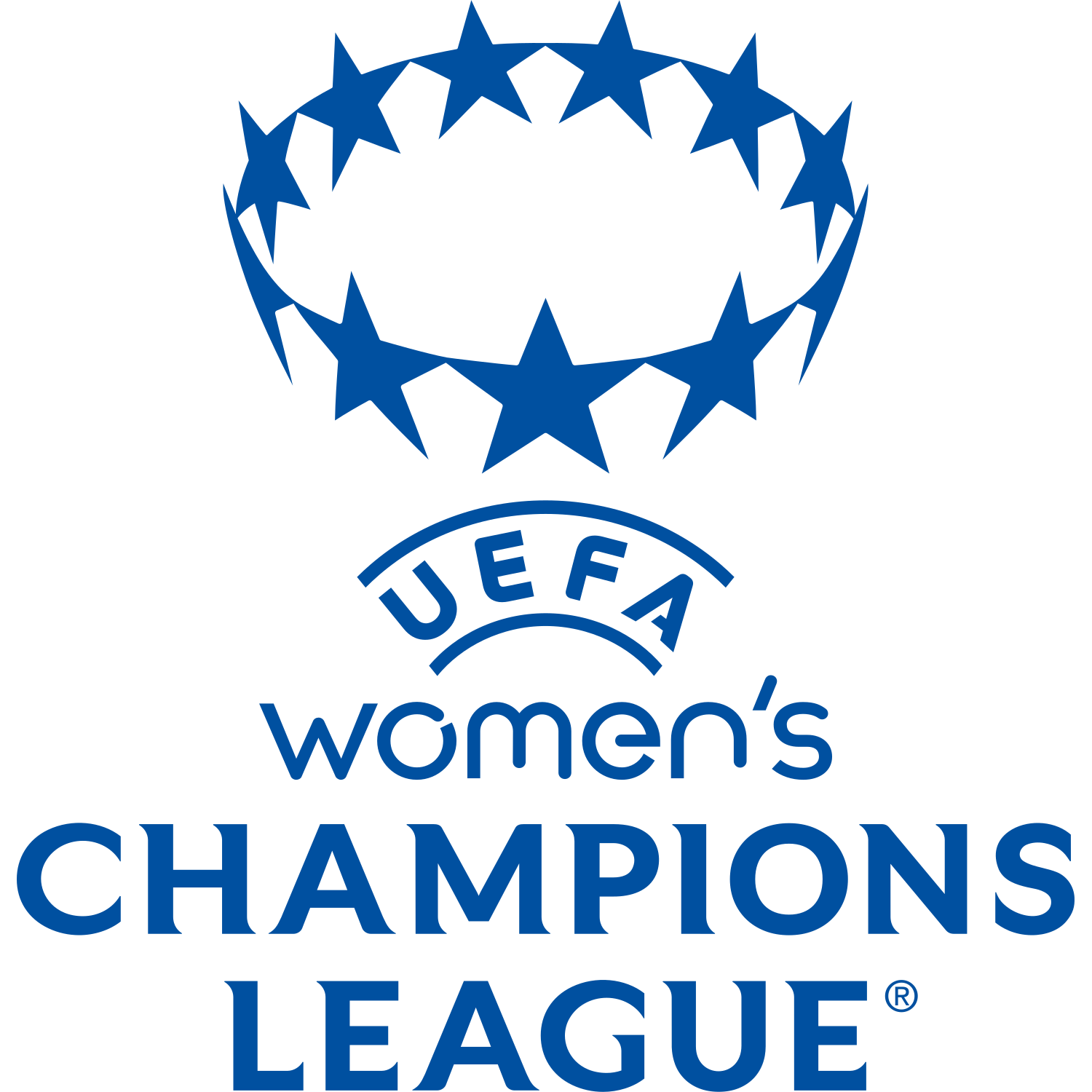
The UEFA Women’s Champions League logo is built around a blue starball symbol above the curved UEFA wordmark and the stacked “women’s CHAMPIONS LEAGUE” name. The emblem uses a circular crown of stars, directly linking the competition to the wider Champions League visual family while giving the women’s tournament its own dedicated identity.
The starball is the main symbolic element of the badge. Like the men’s Champions League mark, it represents Europe’s elite club competition through a circle of stars, but this version is simplified into a single-colour blue symbol designed for clear use across broadcast graphics, digital platforms, apparel and competition branding.
The blue colour scheme gives the logo a clean, premium and institutional look. UEFA introduced a separate anthem, updated logo and dedicated brand identity for the UEFA Women’s Champions League from the 2021/22 season, describing the new identity as one created to reflect a prestigious, inspiring and progressive competition made up of the best women’s club sides in Europe.
The typography also separates the mark from the men’s competition. The word “women’s” appears in a softer, modern lowercase style above the heavy “CHAMPIONS LEAGUE” lettering, making the identity both connected to the Champions League brand and clearly specific to women’s football.
Historically, the independent UEFA Women’s Champions League brand was part of a wider reform of the competition, including the introduction of a group stage and increased prize money from the 2021/22 season. UEFA later unveiled a further bold new brand identity in 2025 to support the launch of the new 18-team league phase format, showing how the logo system continues to evolve with the growth and commercial profile of women’s club football.


