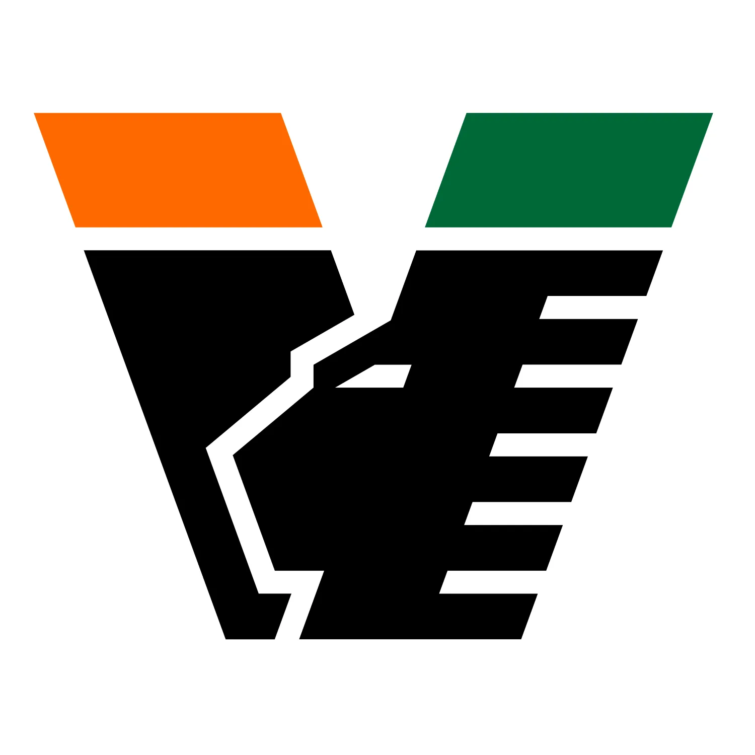
The structure of the badge remains unchanged. The orange and green blocks at the top stay in place, while the lion-inspired “V” now appears in black, giving the crest a stronger arancio, nero e verde identity. The updated version is already being used across Venezia’s official website and digital channels.
The change is not a full redesign, but a color update to the badge introduced in 2022. That previous identity, created by Bureau Borsche, replaced Venezia’s more traditional crest with a minimal “V” mark inspired by the Lion of Saint Mark and the visual language of the city.
Since then, Venezia have become one of football’s most recognizable fashion-led clubs, with kits and campaigns built around a premium visual identity rather than a standard football template. Their orange, black and green palette has been central to that direction, appearing across shirts, pre-match designs and club branding.
The new black version of the logo also connects with Venezia’s recent kit language. A similar color scheme was already visible on the 2025–26 away shirt, before now becoming the club’s main front-facing badge.
No 2026–27 Venezia kits have been unveiled yet, but the updated logo is expected to be part of the club’s visual identity for their Serie A return. Venezia secured promotion back to the Italian top flight after one season away, celebrating the achievement with a canal parade through the city.
A small change, but a clearer identity
For Venezia, this is a subtle update rather than a new era. The badge shape stays the same, but replacing gold with black makes the crest feel more directly tied to the club’s established orange, black and green identity.