
Need more football logos?
You can download this logo individually for free in PNG and SVG, or save time with one of the complete logo packs below.
Each pack includes related football logos in SVG and PNG, organized by size in one clean ZIP file for faster use in websites, designs, presentations, social media, and football projects.
Available logo packs including this logo:


About the Chelsea logo: meaning, evolution and facts
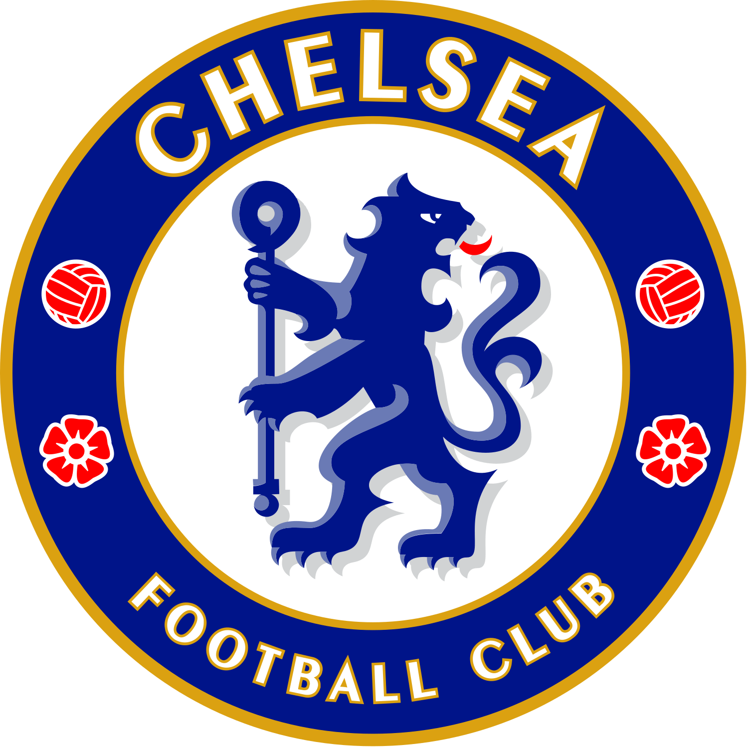
The Chelsea logo is built around a blue heraldic lion standing upright and looking backwards, holding a staff, placed inside a blue circular ring that reads CHELSEA FOOTBALL CLUB. Around the lion sit two red roses and two footballs, with small decorative marks that help balance the composition. It is one of the most recognisable badges in English football, instantly linked with royal blue shirts, Stamford Bridge and the club’s modern identity as “The Blues”.
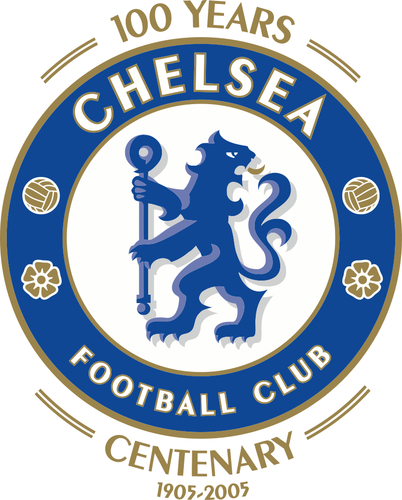
Although it looks like a modern sports logo, the crest is deeply rooted in local heraldry. The lion and staff are adapted from historic coats of arms connected to Chelsea and its former club presidents, while the roses and circular layout give the badge a distinctly English, almost traditional feel. The current version, introduced in 2005 for the club’s centenary, is a refined return to the classic lion crest first used in the 1950s, updated to work cleanly on shirts, merchandise and digital media.
Origins of the Chelsea crest
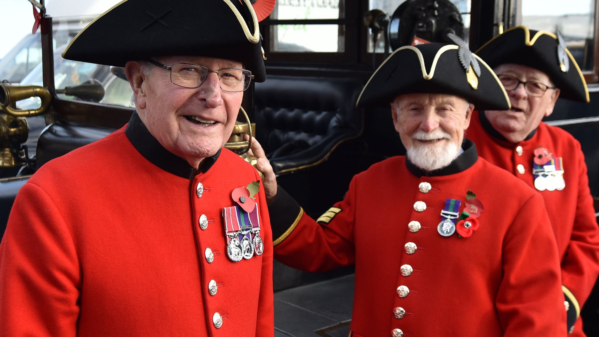
When Chelsea were founded in 1905, their first emblem wasn’t a lion at all, but a Chelsea Pensioner – the iconic army veteran from the nearby Royal Hospital Chelsea. The early crest showed a detailed portrait of a pensioner, sometimes inside a circular frame with “Chelsea Football Club” around the edge. This image gave the club its original nickname, “The Pensioners”, and remained associated with Chelsea for roughly half a century, though it did not regularly appear on players’ shirts.
By the early 1950s, manager Ted Drake wanted to modernise the club’s image. He saw the pensioner badge as old-fashioned and pushed for a more dynamic symbol. As an interim step in 1952, Chelsea adopted a minimalist “cipher” crest showing only the initials C.F.C., which appeared on some materials while a long-term replacement was being prepared.
The transformation came in 1953, when Chelsea unveiled a completely new badge: a blue lion rampant regardant holding a staff, surrounded by a circular border, roses and footballs. This design brought together heraldic motifs from local coats of arms and finally created a crest that looked both modern and distinctly tied to the club’s home borough. It would go on to appear on match shirts from the early 1960s and become the central image of Chelsea’s identity for decades.
Why Chelsea are called “The Blues”
Chelsea’s main nickname, “The Blues”, is directly linked to the club’s colours and, by extension, its badge.
From the early years, Chelsea played in blue, originally a lighter “Eton blue” inspired by the colours of the club’s president, before switching to a deeper royal blue around 1912. Over time, this royal blue became so strongly associated with the club that it naturally produced the nickname “The Blues”. Later kit changes in the 1960s, when Chelsea adopted an all-blue shirt-and-shorts combination with white socks, strengthened this visual identity.

The lion on the crest is also rendered in blue, reinforcing that connection between nickname, kit and logo. In other words, the badge doesn’t just sit on a royal blue shirt: it embodies the colour that defines the club.
What the symbols on the Chelsea badge represent
The Chelsea crest is packed with carefully chosen symbols. Only elements with well-documented meanings are listed here.
- Blue lion rampant regardant
- The lion is a heraldic “lion rampant regardant” – standing upright and looking back over its shoulder.
- This figure is taken from the arms of Viscount Chelsea / the Earls of Cadogan, who had strong ties to the club and were influential in the area.
- Using this lion links the club to local nobility and gives the badge a regal, authoritative feel.
- The staff (crozier)
- The lion holds a staff or crozier, a stylised shepherd’s crook often associated with ecclesiastical authority.
- This staff is derived from the arms of the Abbots of Westminster, who were historically Lords of the Manor of Chelsea, tying the logo back to the area’s medieval and religious history.
- Red roses
- The crest includes three red roses, positioned around the lion.
- These represent England, echoing the Tudor rose and underlining Chelsea’s identity as an English club despite its modern global profile.
- Football motifs
- Two footballs appear on the badge, balancing the composition and making the sport explicit.
- They serve as a straightforward reminder that, despite all the heraldry and history, Chelsea is first and foremost a football club.
- Circular ring and wording
- The blue ring with CHELSEA FOOTBALL CLUB in white creates a bold, logo-like frame.
- This circular form is typical of mid-20th-century sports badges and makes the crest highly adaptable for shirt patches, merchandise, and broadcast graphics, while still feeling like a traditional emblem.
Evolution of the Chelsea crest
Chelsea’s badge history can be broken into a small number of clear eras, each with a distinct look.
.jpg)
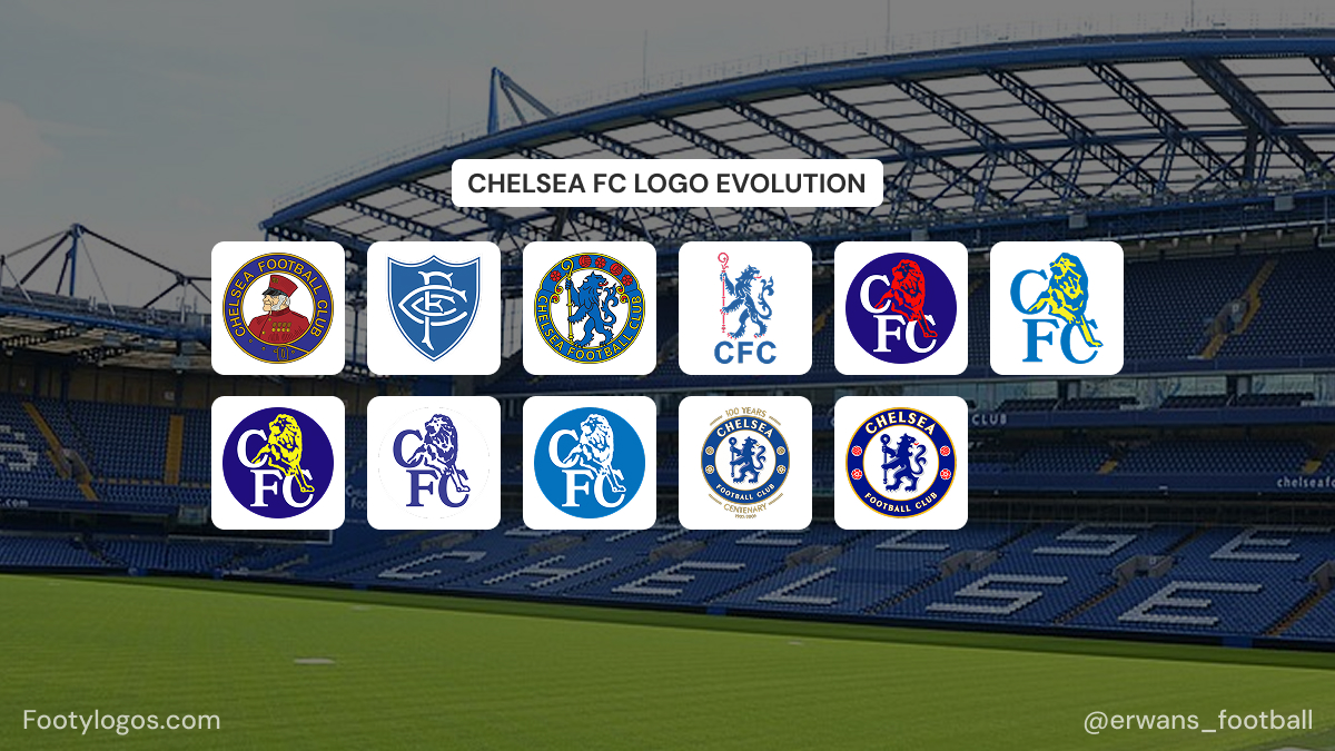
- 1905–1952 – The Pensioner era
- The first crest showed a Chelsea Pensioner, honouring the retired soldiers of the Royal Hospital Chelsea.
- This image appeared on club materials and contributed to the “Pensioners” nickname, but it did not become a regular shirt badge.

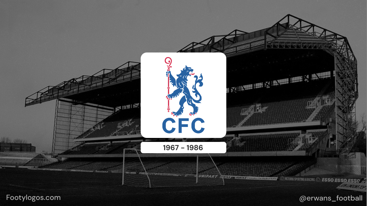
- 1952–1953 – The C.F.C. cipher
- Under Ted Drake’s modernisation, the old pensioner image was dropped.
- A temporary emblem with just “C.F.C.” initials was used for about a year while a more ambitious redesign was prepared.
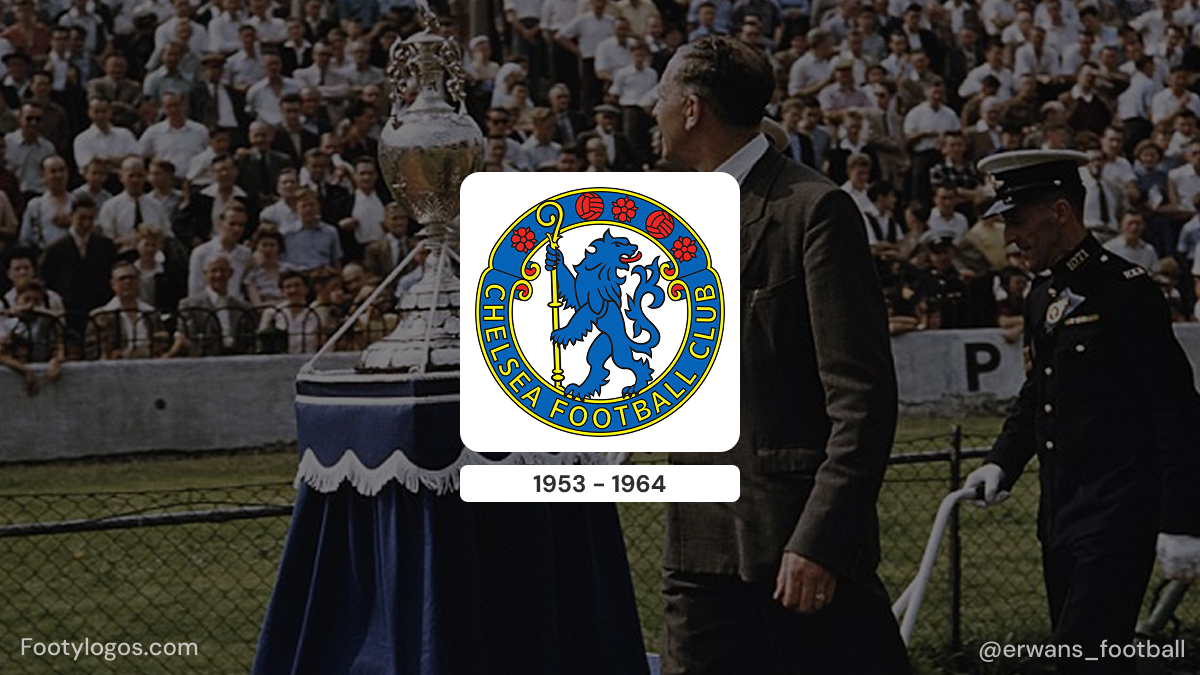
- 1953–1986 – Birth of the lion crest
- In 1953, Chelsea introduced the famous blue lion rampant regardant holding a staff, with three red roses and two footballs in a circular badge.
- This crest, combining borough and noble heraldry, became the first to appear consistently on players’ shirts from the early 1960s and defined Chelsea’s visual identity for more than three decades.
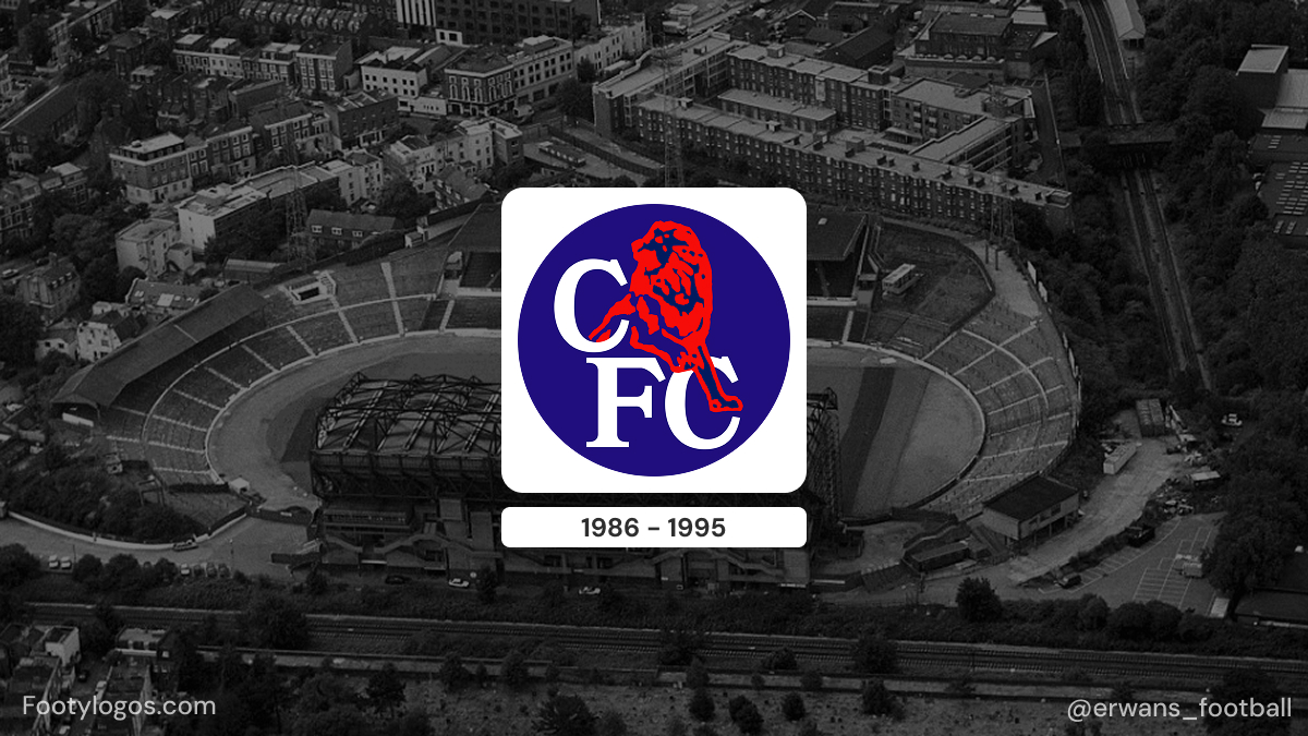
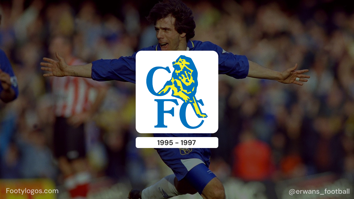
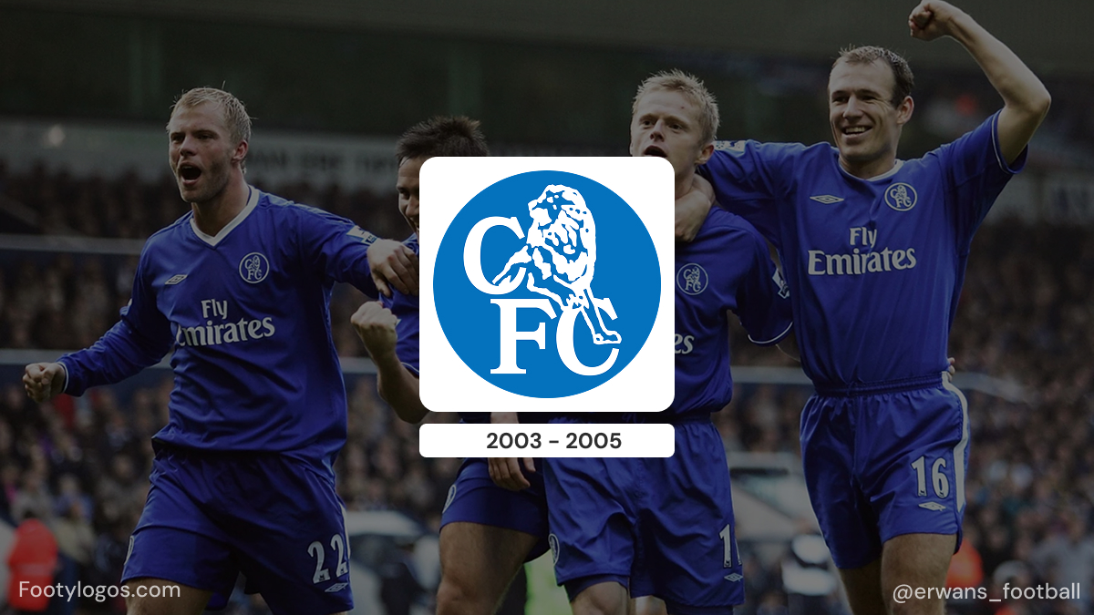
- 1986–2005 – Modernised lion and CFC initials
- In 1986, with Ken Bates as owner, the badge was redesigned again. The aim was partly modernisation and partly to create a crest that could be easily copyrighted.
- The new logo showed a more naturalistic lion standing over large “CFC” initials, with several colour tweaks over the years (including red and yellow variants) but a generally more corporate, simplified look compared to the heraldic 1953 crest.
.jpg)
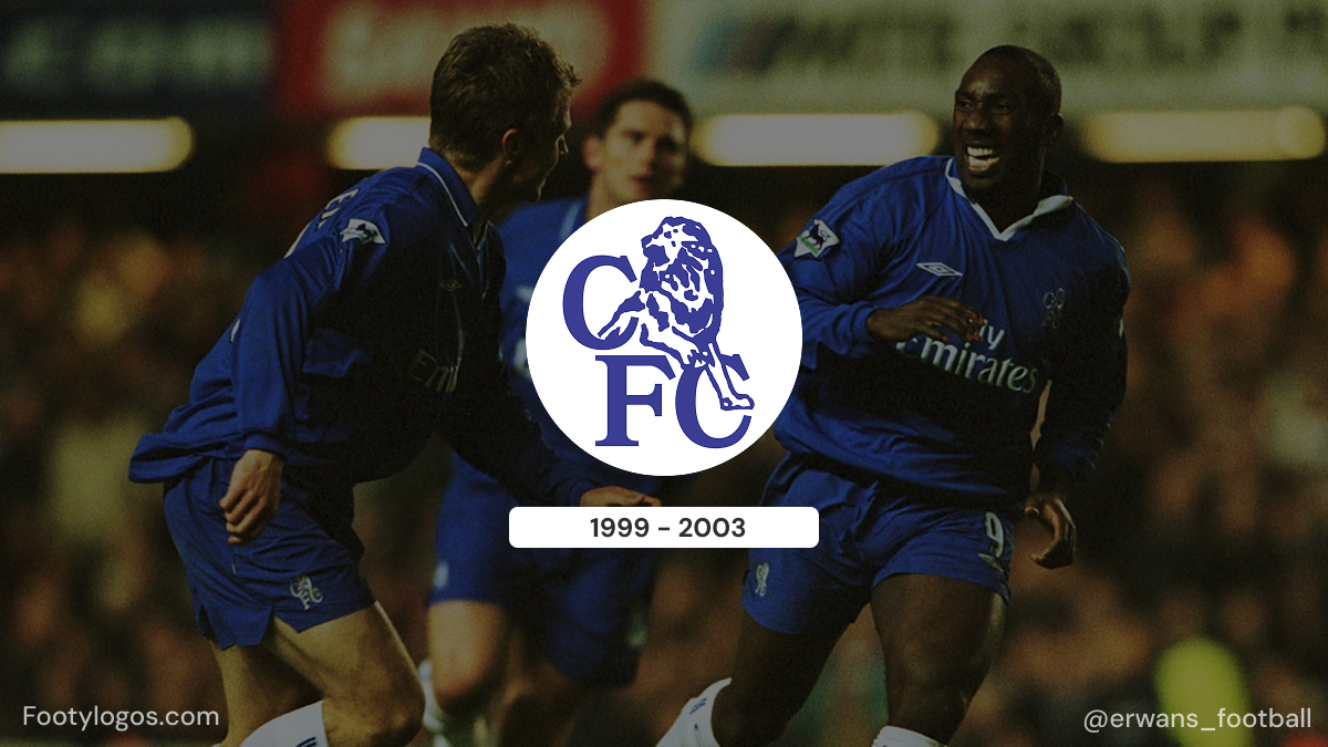
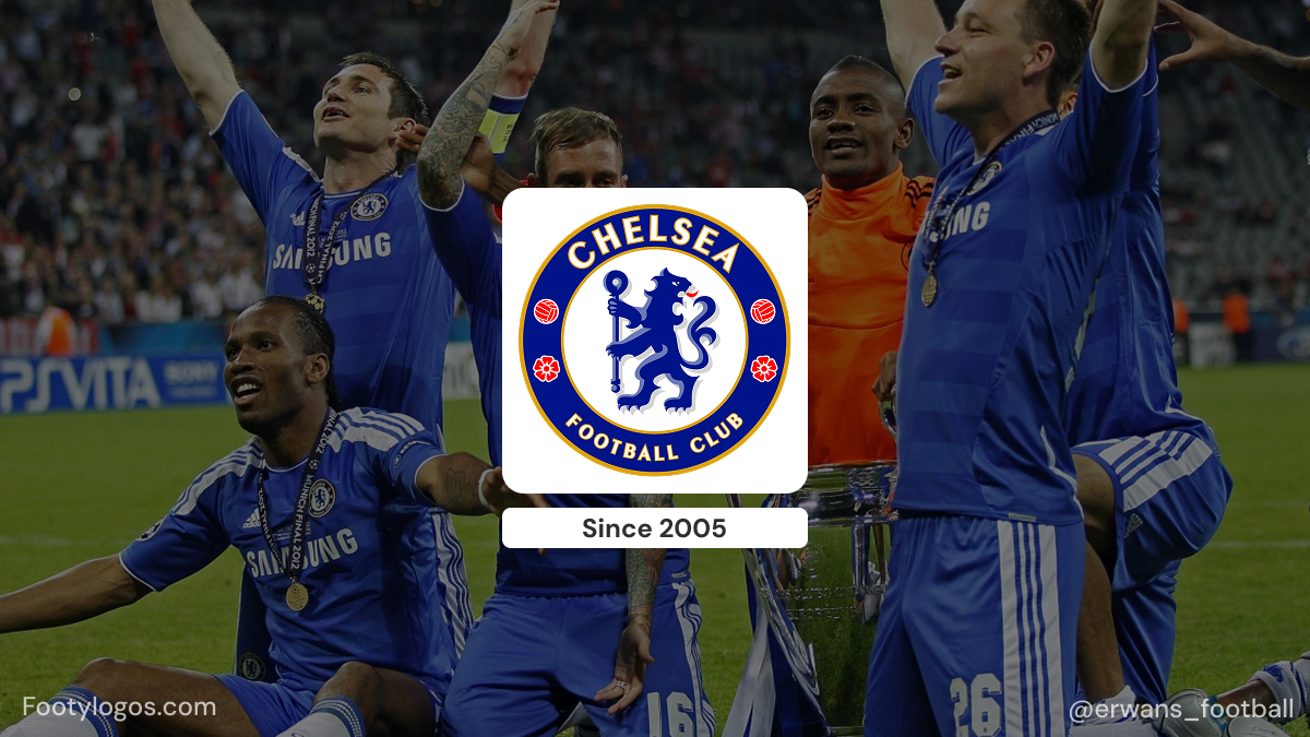
- 2005–today – Return to the classic lion
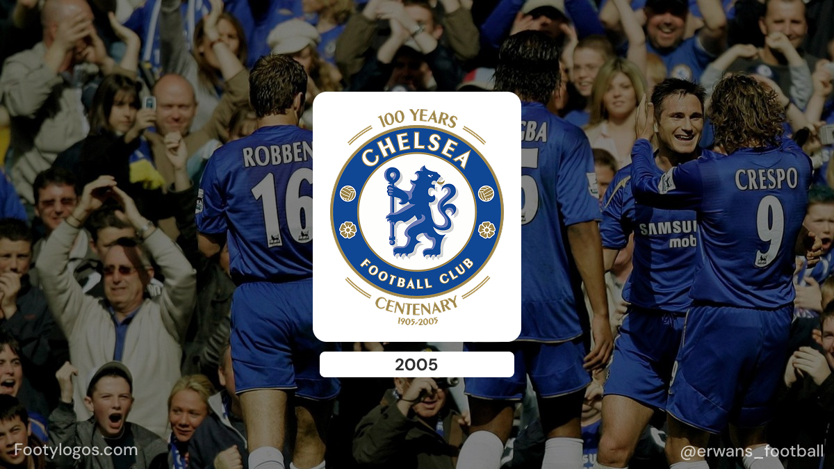
- Approaching the centenary and responding to fan pressure, Chelsea decided in 2005 to return to a design closely based on the 1953 lion badge.
- The centenary crest, used in the 2005–06 season, added “100 YEARS” and “CENTENARY 2005–2006” around the edge. After that season, the wording was removed, leaving the modern version of the badge that is still used today.
Across all these eras, one element has become permanent: the lion. Even when the layout and lettering changed, the lion remained the anchor of Chelsea’s visual identity.
Colours and typography
The Chelsea crest’s colour palette mirrors the club’s kit:
- Royal blue is the dominant colour, used for the lion and the circular border. It matches the famous home shirts and underpins the nickname “The Blues”.
- White is used for the club name around the circle, ensuring it stands out clearly against the blue.
- Red and yellow/gold appear as accent colours: red for the roses and parts of the lion’s details, and yellow/gold for outlines and decorative elements, adding warmth and contrast.
The wordmark CHELSEA FOOTBALL CLUB is set in a simple, bold, all-caps sans-serif style, following the curve of the circular ring. It is not advertised as a specific commercial typeface; instead, it behaves like a custom, functional sports lettering designed for maximum legibility on fabric and at distance. The combination of strong geometric lettering with a traditional heraldic lion gives the crest a balance of modern logo clarity and classic club heritage.
Logo-related trivia for fans
- From “Pensioners” to “Blues” – The original pensioner crest and nickname were deliberately phased out under Ted Drake, who felt they were outdated. As the royal blue kit identity grew stronger, the “Blues” nickname effectively replaced “Pensioners” and is now reflected in both the shirt and the lion’s colour.
- First crest on shirts – The 1953 lion badge was the first Chelsea crest to appear regularly on match shirts, starting in the early 1960s. Earlier pensioner emblems mostly lived on programmes and printed materials rather than kits.
- Heraldic approval – In the 1970s, a version of the lion-and-staff mark was granted as a heraldic badge for Chelsea via the College of Arms, formalising the design in traditional heraldic language and underscoring how closely the club’s logo is tied to English heraldry.
- Copyright and commerce – The 1986 redesign, with the lion over “CFC”, was driven partly by practical needs: chairman Ken Bates wanted a crest that the club could trademark and control more easily at a time when football merchandising was expanding rapidly.
- Centenary nostalgia – The 2005 centenary badge was hugely popular with supporters because it restored the classic heraldic look. The post-centenary version kept that style permanently, meaning the current crest is essentially a modernised 1950s design rather than a totally new invention.
Taken together, the evolution of the Chelsea logo shows how a club can move from a local cartoon pensioner to a global blue lion, all while staying rooted in the history and heraldry of the place it represents.


