Need more football logos?
You can download this logo individually for free in PNG and SVG, or save time with one of the complete logo packs below.
Each pack includes related football logos in SVG and PNG, organized by size in one clean ZIP file for faster use in websites, designs, presentations, social media, and football projects.
Available logo packs including this logo:


About the Manchester United logo: meaning, evolution and facts
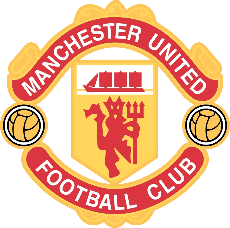
The Manchester United logo is one of the most recognisable crests in world football: a circular badge with “Manchester” and “United” on a golden banner, framing a red shield that combines a three-masted ship and the famous Red Devil holding a trident. Two stylised footballs sit on either side of the shield. The design fuses Manchester’s civic identity – via the ship borrowed from the city’s coat of arms – with the club’s modern, intimidating nickname, “The Red Devils”. Over time, the crest has been simplified for merchandising and digital use, but its core elements have remained remarkably consistent.
Modern versions of the badge are applied in full colour on home and away kits, while special editions sometimes play with outlines, textures or even remove the circular frame entirely. Despite these variations, the ship + devil + footballs + circular banner formula is now deeply embedded as Manchester United’s visual identity.
Origins of the Manchester United crest
Manchester United’s visual story begins long before the “Red Devils” era, back when the club was known as Newton Heath LYR Football Club, founded by railway workers in 1878.
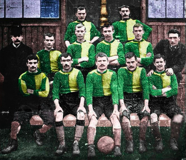
Early badges reflected those industrial roots:
- The first known emblem featured a detailed steam locomotive on a green-and-gold shield, explicitly referencing the Lancashire & Yorkshire Railway that created the team. This was an industrial emblem more than a football symbol, used on club materials rather than regularly on shirts.
- A later Newton Heath design simplified things and experimented with regional symbolism, including a red Lancashire rose on a white shield, signalling geographic pride rather than the club’s railway origin.
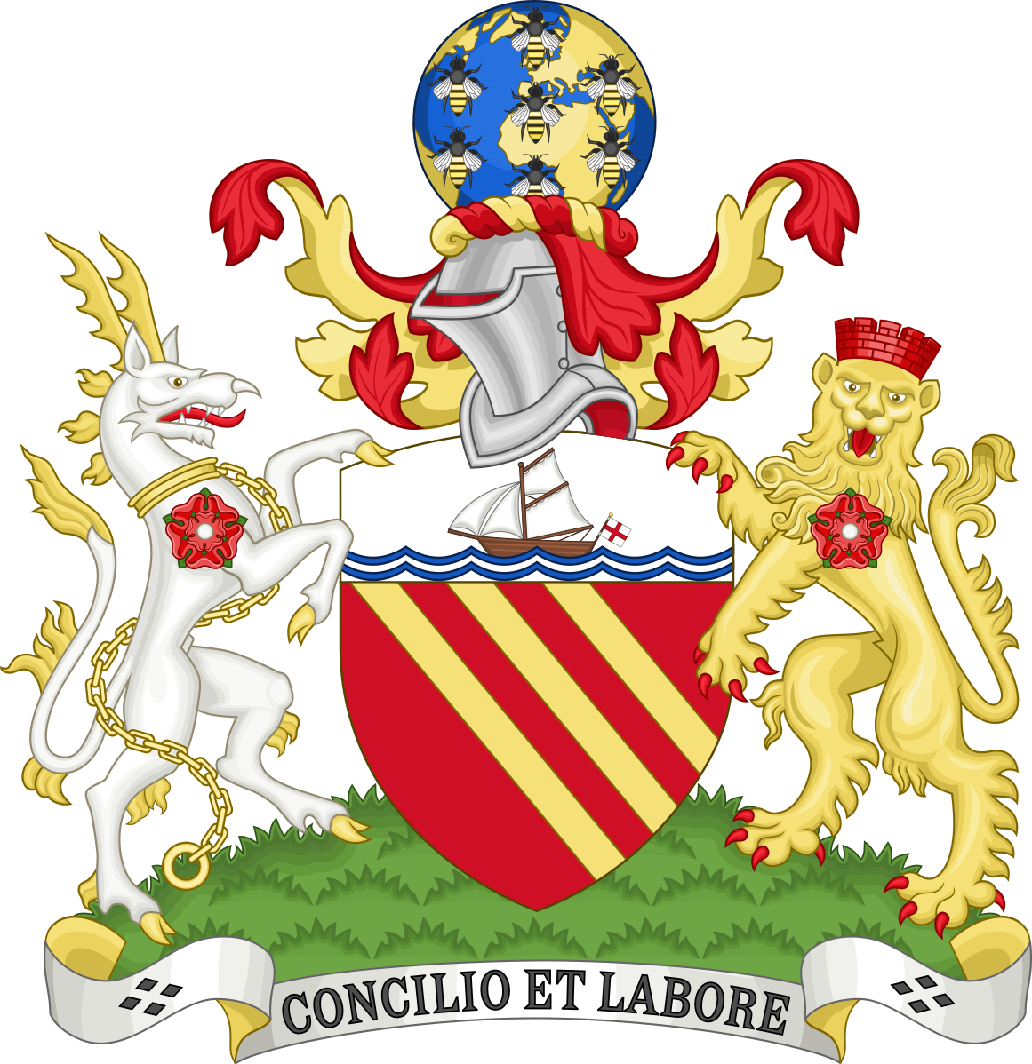
In 1902, Newton Heath became Manchester United, and with the new name came a move towards a more civic and heraldic look. For several decades, rather than a unique club-only badge, United often leaned on a modified version of the Manchester City Council coat of arms, particularly on cup final programmes and official documents.
The pivotal moment for a fully recognisable club crest arrived at the 1963 FA Cup Final, when a badge based on the city’s coat of arms, featuring the ship and shield, appeared on United’s shirts. This was effectively the first “modern” Manchester United badge worn in a major showpiece game and laid the foundations for the circular logo fans know today.
Why Manchester United are called “The Red Devils”
Manchester United’s nickname “The Red Devils” is tightly connected to the current badge. The name itself, however, came before the devil appeared on the crest.
- In the late 1950s and early 1960s, manager Matt Busby was looking to move away from the “Busby Babes” image after the Munich air disaster, feeling it sounded too fragile for a top side rebuilding itself.
- Around that time, Salford rugby club had gained the nickname “The Red Devils” after a tour in France, and Busby liked the intimidating sound and imagery. He adopted it for Manchester United, and the club began using the Red Devil figure on match programmes and scarves during the 1960s.
Visually, this shift set the stage for a new identity: instead of relying purely on civic heraldry, United could lean into a single, bold mascot-type figure. The devil was finally incorporated into the official club crest in 1970, and that circular badge with the Red Devil at its centre has defined the club’s logo ever since.

What the symbols on the Manchester United badge represent
The current crest is dense with meaning, but only a few elements have well-documented interpretations:
- The three-masted ship
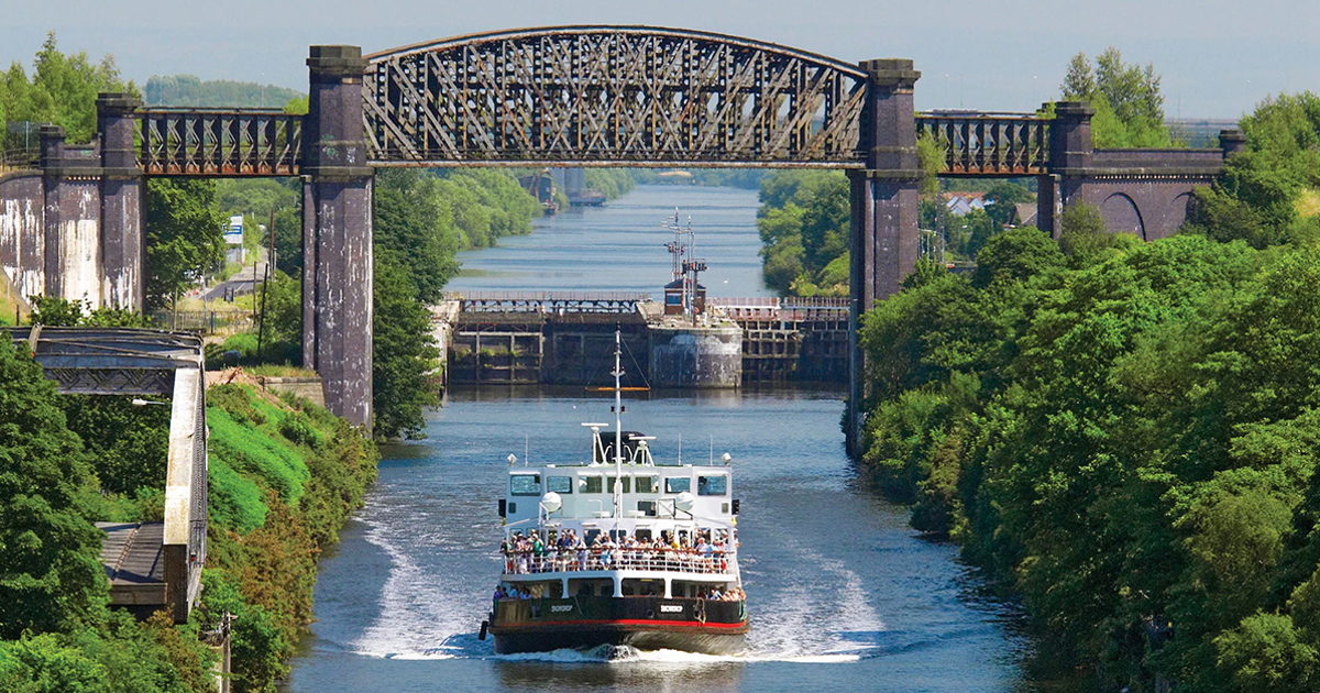
- The ship is inherited from the Manchester city coat of arms, representing the city’s trading history and the importance of the Manchester Ship Canal as a route connecting the industrial North West to the seas.
- It also visually ties United to other Manchester institutions, including Manchester City and local universities, which use similar ships in their arms.
- The Red Devil holding a trident
- The devil directly represents the club’s nickname, “The Red Devils”.
- The trident gives the figure a distinctive silhouette and emphasises a combative, fearsome identity – a clear break from the more formal civic heraldry of earlier crests.
- In 1975, this devil figure was even granted as a heraldic badge by the College of Arms for use by Manchester United in connection with the English Football League, underlining its official status.
- The footballs on either side of the shield
- The two footballs placed on the outer sections of the badge are straightforward: they assert United’s identity as a football club, balancing the more symbolic ship and devil with a literal reference to the sport.
- The shield and circular banner
- The central red shield echoes the shield structure of the Manchester coat of arms, while the gold circular banner with “Manchester” and “United” wraps around it, turning a traditional heraldic device into a modern, logo-like mark that works well on shirts, merchandise and digital media.
Evolution of the Manchester United crest
The badge has gone through a series of recognisable milestones rather than constant small tweaks:
- 1878–1902 – Newton Heath industrial badges
- Early emblems featured a green-and-gold shield with a detailed steam locomotive, reflecting the club’s creation by Lancashire & Yorkshire Railway workers. Later versions also used the club’s name and “Lancashire & Yorkshire Railway” wording in a more traditional crest layout.
- 1902–1960s – City coat of arms era
- After the name change to Manchester United, the club gradually adopted badges derived from the Manchester City Council coat of arms, with a shield and ship motif used across club materials and occasionally on kit for big occasions, but not yet as a consistent, circular “logo”.
- 1940s – Early Red Devil experiments
- Branding sources point to a 1940s crest that already combined the ship and a devil figure, a clear precursor to the modern badge. However, this design wasn’t used consistently and the devil disappeared again for a period.
- 1963–late 1960s – First modern-style crest on shirts
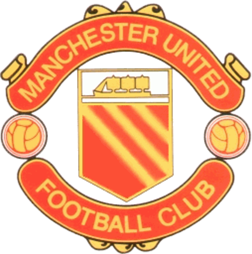
- For the 1963 FA Cup Final, United wore a crest adapted from the city’s arms: ship at the top, shield in the middle, and a more formal banner layout. This marks the first widely recognised Manchester United badge on a major match shirt. Over the decade, variants experimented with simplified shields and a striped triangle below the ship, still without a permanent devil symbol.
- 1970–1998 – Classic circular badge with Red Devil
- In 1970, United introduced the now-classic circular crest with “Manchester” and “United” on a golden banner and the Red Devil holding a trident in the centre beneath the ship. The badge appeared on shirts from 1971 and quickly became synonymous with the club’s identity at home and abroad.
- 1978 – Centenary crest
- For the club’s 100-year centenary (1878–1978), a commemorative crest was used briefly, tweaking the standard design and incorporating centenary wording. After the celebration, United reverted to the previous Red Devil badge.

- 1998–present – Simplified modern crest
- In 1998, the badge was refreshed: the words “Football Club” were removed, leaving just “Manchester” on the top banner and “United” on the bottom. The colours were made brighter and more consistent for print and broadcast, and this remains the core crest used today across home and away kits.
- From 2023 onwards, select third kits have gone further by using the Red Devil motif alone on the chest, demonstrating how strong that single symbol has become within the wider logo system.
Colours and typography
The Manchester United crest leans on a tight palette that echoes the home kit:
- Red dominates the shield and devil, matching the famous red shirts and reinforcing the “Red Devils” nickname.
- Yellow/gold is used on the outer circular banner and the footballs, helping the crest stand out on fabric and giving it a bold, high-contrast look suitable for TV, print and digital.
- Black outlines and details provide definition, making the logo legible even at small sizes or in monochrome applications.
The wordmark uses a bold, condensed sans-serif style in uppercase letters (“MANCHESTER” and “UNITED”), laid out on the curved banner that frames the central shield. This gives the crest a modern, logo-like feel compared with older heraldic versions, while still harmonising with the more traditional shield and ship.
Logo-related trivia for fans
- First modern badge on a major shirt: The 1963 FA Cup Final is widely recognised as the first time a modern Manchester United crest based on the city’s arms appeared on the team’s shirts.
- A devil with official heraldic status: In 1975, the Red Devil holding a trident was formally granted as a heraldic badge by the College of Arms for Manchester United’s use in the English Football League, confirming its place as an official symbol rather than just a marketing motif.
- A centenary detour: For the 1878–1978 centenary celebrations, United used a special crest variant, then reverted to the standard Red Devil design afterwards – making that centenary badge a favourite among collectors.
- Dropping “Football Club”: The 1998 redesign that removed “Football Club” from the bottom of the crest remains controversial among some supporters, but it was done to simplify the badge and make “Manchester United” more prominent as a global brand.
- Ship shared across the city: Both Manchester United and Manchester City use a similar three-masted ship sourced from the Manchester coat of arms, meaning the element is a symbol of the city rather than either club alone.
- Third kit with only the devil: Recent third shirts have experimented with using only the Red Devil instead of the full crest, marking the first time that single icon has appeared alone as the chest badge in competitive kits.

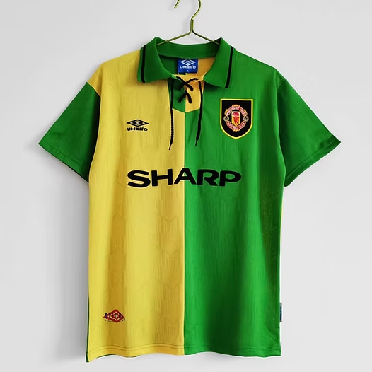
- Green and gold echoes: The green-and-gold colour scheme of Newton Heath’s early emblems has been referenced in later kit designs, notably the 1992 away strip, keeping a visual thread from the industrial railway club to the global Manchester United brand.
All together, the Manchester United logo is a rare example of a crest that manages to combine civic heraldry, a mascot-style figure and modern branding into a single, instantly recognisable symbol for generations of fans.