Diabolical football badges: 5 teams with the devil in their logos
Some clubs lean into lions, eagles or city coats of arms. Others go straight to hell.
Devils, imps and pitchforks are surprisingly common in football iconography – sometimes born from local legends, sometimes from pure marketing, sometimes from a team playing “like devils” in a particular era. Here are five badges where the devil isn’t just a nickname, but literally part of the crest.

1. Manchester United – When the Red Devil replaced the “Busty Babes”
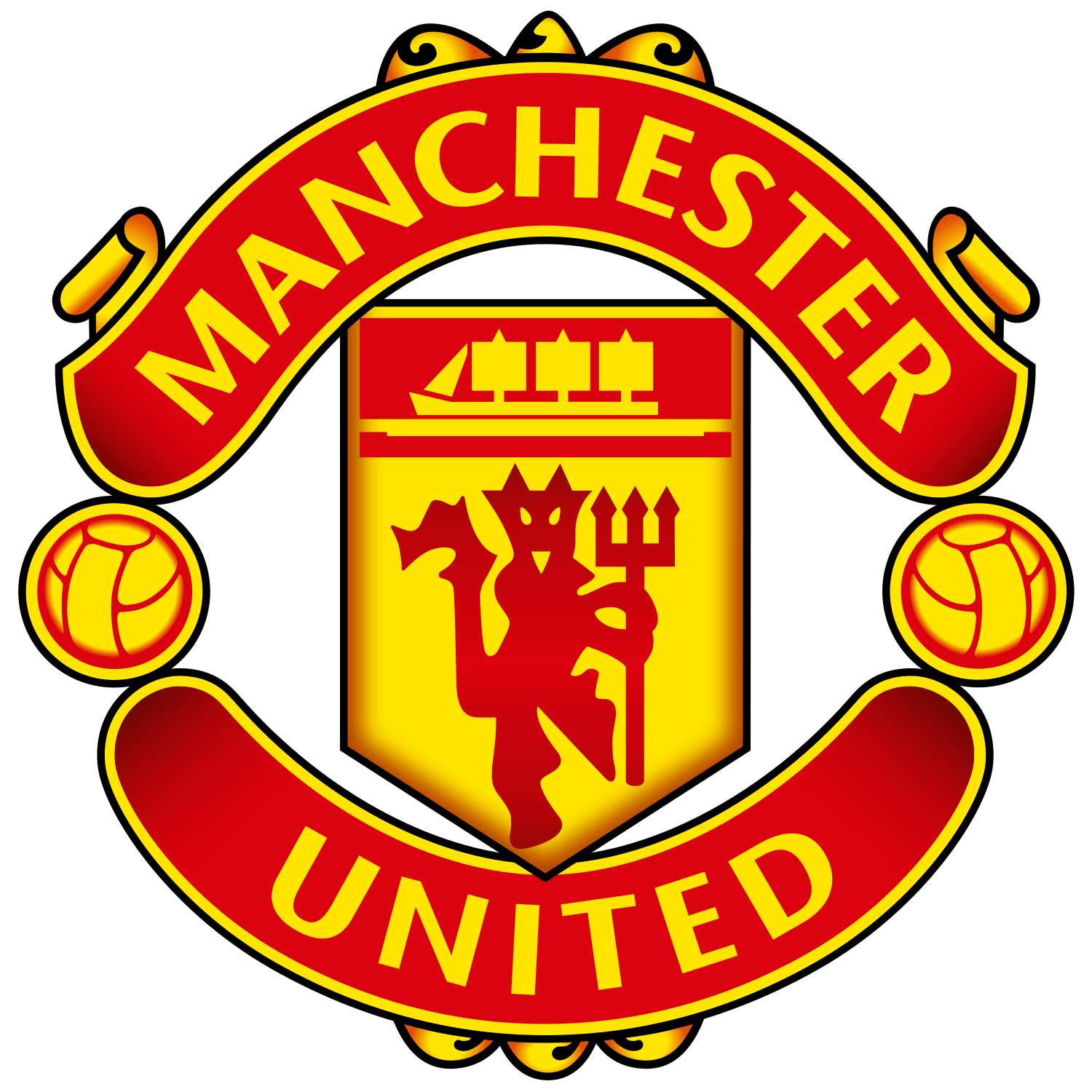
Manchester United’s identity as the “Red Devils” is so ingrained that it’s easy to forget how recent the devil actually is in crest terms.
For decades, United’s badge was based on the coat of arms of the city of Manchester: ship, shield, and no demon in sight. The shift starts in the 1960s with Sir Matt Busby, still rebuilding the club in the years after the Munich air disaster. Looking for a more intimidating identity than the soft-sounding “Busby Babes”, Busby borrowed the nickname “Red Devils” from nearby rugby league side Salford, who had been dubbed Les Diables Rouges on a tour in France.
The devil first appears not on the main crest but on match programmes and scarves – a small, stylised figure with a trident that gradually becomes associated with United’s new persona.
The decisive step comes around 1970, when the club’s badge is officially redesigned: the central shield is simplified, the three vertical stripes disappear, and a red devil holding a pitchfork takes centre stage beneath the ship.
In 1973, another tweak removes the words “Football Club” from the ribbon, but the devil stays – and has remained on the primary crest ever since, even as details like the roses/footballs and typography have evolved.
The devil has also broken out as a standalone emblem. United’s 2024–25 third kit, for example, replaces the full crest with a solo Red Devil mark on the chest – a reminder of how powerful that single diabolical silhouette has become as a brand by itself.
2. Lincoln City – The cathedral imp that climbed onto the shirt

Lincoln City’s devil isn’t a horned giant, but a squat, grinning creature from medieval folklore: the Lincoln Imp.
High up in Lincoln Cathedral, a 13th-century grotesque sits cross-legged on a pillar in the Angel Choir. Over centuries, a local legend grew around it: a mischievous imp sent by the devil to cause chaos in the cathedral, turned to stone by an angel mid-rampage. The figure became the unofficial symbol of the city and appears all over Lincoln – on souvenirs, civic logos and local lore.
The football club picked up the nickname “The Imps” early in the 20th century, but for a long time their crest was entirely conventional, based on heraldic shields rather than the creature itself. According to logo histories, Lincoln City only introduced a badge featuring the Imp in 1971 – relatively late, considering the nickname dates back to at least the 1910s.
From there, the club leaned into the character:
- 1971–82: a more traditional imp figure appears in the crest.
- 1980s–90s: a cartoonish standing Imp, with club initials and later a circular badge around it.
- 2010s: the club returns to a “traditional” Imp badge associated with Graham Taylor’s successful side of the 1970s and 80s, re-elevating it as the primary crest after fan consultation.
What makes Lincoln’s devilish element unique is how tightly bound it is to place. This isn’t a generic demon: it’s a very specific, very local monster that first stared down from cathedral stonework before it ever appeared on polyester.
3. Virtus Entella – The Black Devil of Chiavari
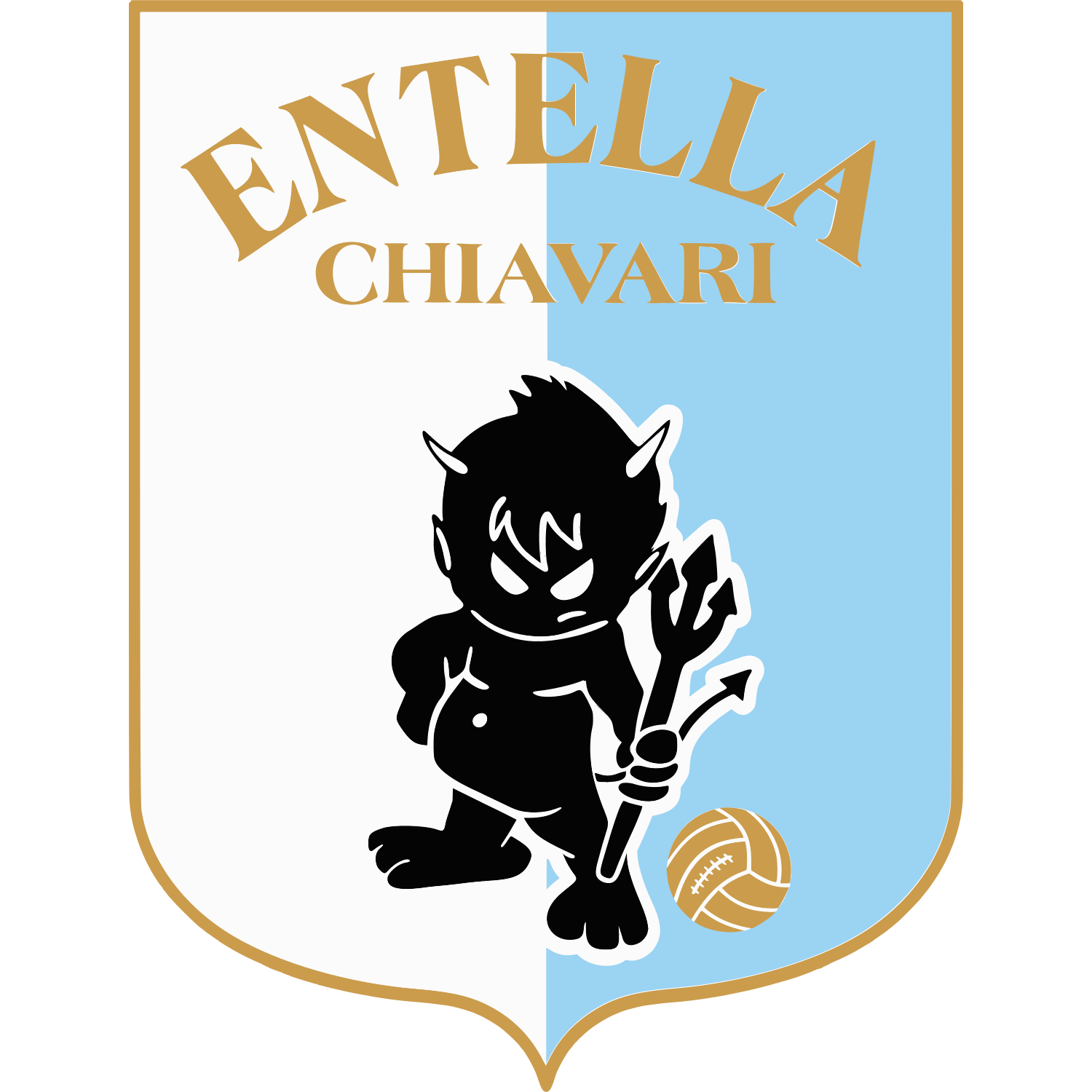
Virtus Entella are not a global superclub. They’re a small, community side from Chiavari in Liguria – but their badge is one of the most unexpectedly diabolical in Italian football.
Their nickname, I Diavoli Neri (“The Black Devils”), dates back to the 1930s. Sporting journalist Dario Costa – who later became club president – coined the term after watching Entella in all-black kits, describing players who seemed “indiavolati” (possessed) in their intensity. The nickname stuck.
From there, the devil moved from words to imagery. By the mid-20th century, Entella were using a Samnite-style shield split vertically in white and light blue, with “Entella Chiavari” at the top and, crucially, a small black devil – trident in hand, ball at its feet – in the centre.
After bankruptcies, refoundations and a name change, the modern badge “returns” to that 1935-era model: the same pale blue and white bipartite shield, the same mischievous diavoletto nero as mascot.
The devil isn’t a marketing afterthought here; it’s the core of the club’s visual identity. Recent features in Italian media still present Virtus Entella’s logo as a “black devil” that embodies the club’s history and values – a slightly paffuto, almost cute demon that feels very Ligurian and very specific to Chiavari, rather than a generic intimidating emblem.
4. América de Cali – When the Red Devils had to hide their demon

If you’re talking about devils in South American football, América de Cali are impossible to ignore. Their nickname, Los Diablos Rojos, isn’t just poetic – the devil literally lives on their badge.
The club’s earliest known crest in the 1930s was a map of South America inside a circular frame, reflecting the “América” name rather than any infernal theme.
The turning point comes in the 1940s, when a new crest appears featuring a red devil. Contemporary accounts say the symbol was adopted because América’s players “jugaban como verdaderos diablos en la cancha” – they “played like true devils” on the pitch. The devil was a symbol of fiesta and intensity rather than blasphemy.
Things get more complicated with the arrival of legendary coach Gabriel Ochoa Uribe in the 1970s and 80s, the architect of América’s great golden era. A devout Catholic, Ochoa saw the devil on the crest as spiritually problematic. Under his influence, América’s match kits dropped the devil entirely and used simplified shields with just the stars for league titles, even as the club racked up championships and Copa Libertadores runs.
By 1992, the devil was removed from the playing crest altogether and restricted to more administrative or institutional uses. Then, for the club’s 70th anniversary in 1997, América effectively “rehabilitated” the devil, re-introducing the traditional figure on the match shirts and explicitly framing it as a purely figurative, identity-based symbol – not a theological statement.
Since then, the silhouette has been refined, but the core idea remains: a stylised devil in motion, often with a ball, framed by the word “América” and title stars above. At one point, for the 80th anniversary in 2007, even that diabolical figure briefly disappeared again in favour of a special “80 años” crest – but it soon returned.
Few badges embody such a direct clash between religious culture and football branding: América’s devil has been adopted, censored, exiled and finally accepted again as part of the club’s DNA.
5. AC Milan (1979–1986) – When Il Diavolo took over the shirt

AC Milan have been associated with the devil since their foundation. Herbert Kilpin chose red and black to represent “the fires of hell” and the terror they should inspire in opponents; from there, Il Diavolo became one of the club’s enduring nicknames.
For most of their history, however, Milan’s crest was not a devil at all. The badge tended to show the city flag of Milan (the red cross on white associated with Saint Ambrose) alongside red-and-black stripes, with various tweaks between the 1930s and 1970s.
That changes at the very end of the 1970s. After winning their 10th Scudetto in 1979, Milan earn the right to wear a gold star for sporting excellence above their badge – and at the same time adopt a striking new club logo: a stylised red devil figure holding a trident, with that golden star above its head.
This “diavoletto” logo becomes the primary mark on shirts in the early 1980s, used roughly between 1979 and 1986 depending on the source. It strips the identity down to pure mythology – no cross, no stripes, just the devil and the star, often rendered as a simple red outline on white. Contemporary crest histories list it as the official badge from 1982–86, sitting between the more traditional pre-1979 shield and the oval crest that arrives in the late 1980s.
By 1986, as Silvio Berlusconi takes over and ushers in a new era, Milan retire the devil-only crest and introduce the oval badge that fans recognise today: vertical red-and-black stripes on one side, the city flag on the other, “ACM” and “1899” framing it.
The devil, though, never really disappears. The club’s official mascot, Milanello, is a cartoon red devil in full kit, and in recent years Milan have revived the vintage diavoletto logo as a secondary mark – appearing on merchandise and even as a throwback detail on modern Puma kits, including the 2018–19 range and the 2025–26 second shirt.
For a brief window in the 80s, though, Milan did what almost no other major club dared: they put the devil itself, and nothing else, on the badge.