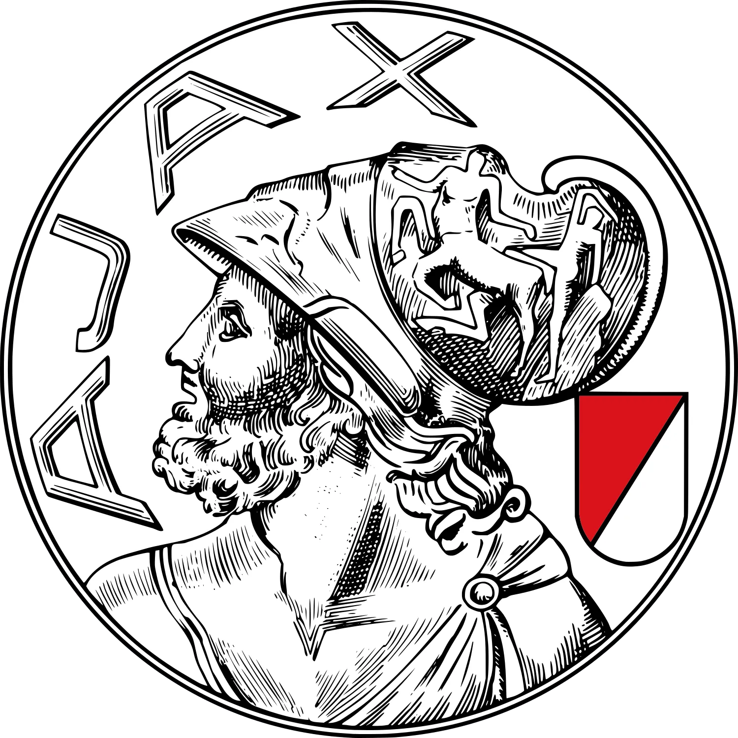


O logotipo do Ajax Amsterdam é um dos brasões mais distintos do futebol porque é construído em torno de uma figura mitológica, em vez de um marco da cidade, animal, escudo ou dispositivo heráldico tradicional. O emblema representa Ájax, o herói grego do qual o clube leva o nome, e historicamente tem sido mostrado como um retrato clássico detalhado ou como um desenho de linha altamente simplificado.
De 1991 a 2025, o Ajax usou a famosa versão minimalista do emblema: um emblema circular contendo a cabeça do herói grego Ajax, desenhado com 11 linhas separadas, uma referência direta aos 11 jogadores de um time de futebol. Isso fez do brasão um exemplo raro de identidade futebolística reduzida quase a um exercício de design gráfico: abstrato, inteligente e instantaneamente reconhecível.
Desde o Temporada 2025—26, o Ajax retornou oficialmente ao seu brasão clássico, a versão mais detalhada originalmente introduzida em 1928. O clube anunciou o retorno permanente do logotipo clássico em novembro de 2024, conectando a decisão ao seu 125º aniversário e ao desejo de permanecer próximo à identidade histórica do Ajax.
Origens do brasão Ajax
O AFC Ajax foi fundado em Amsterdã em 18 de março de 1900. O clube recebeu o nome de Ájax, o lendário guerreiro grego associado à força, coragem e determinação. A própria história de aniversário do Ajax afirma que o clube foi fundado por um grupo de amigos no centro de Amsterdã e que o herói grego se tornou o tema do logotipo clássico do clube em 1928.
O primeiro emblema do Ajax foi não apresentam a cabeça do herói grego. De acordo com a história comumente documentada do brasão, o primeiro emblema mostrava um jogador do Ajax e foi posteriormente ajustado após a promoção do clube à primeira divisão em 1911 para combinar com as cores atualizadas do kit do clube. O principal ponto de inflexão chegou 1928, quando o emblema do jogador de futebol foi substituído pela cabeça do herói grego Ajax.
O Ajax observa que o emblema do herói grego já havia aparecido na bandeira do clube desde 1925, em homenagem ao 25º aniversário do clube. Sua adoção como logotipo do clube em 1928 deu ao Ajax uma identidade simbólica mais forte, afastando o emblema de uma imagem genérica de futebol para uma ligação visual direta com o nome do clube.
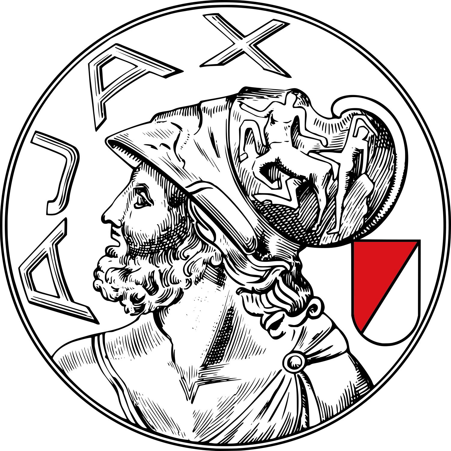
O que os símbolos no emblema do Ajax Amsterdam representam
O herói grego Ajax
A figura central representa Ájax, o mitológico guerreiro grego que deu nome ao clube. A história oficial de aniversário do Ajax descreve o logotipo de 1928 como substituindo o emblema anterior do jogador de futebol pelo herói grego Ajax, simbolizando “força, determinação e espírito guerreiro”.
Graficamente, isso dá ao clube uma das identidades mais incomuns do futebol: o distintivo não é principalmente sobre Amsterdã, na Holanda, ou um brasão local, mas sobre uma figura heróica clássica. Isso torna o logotipo mais literário e mitológico do que a maioria dos brasões de futebol.
O retrato de 11 linhas
O logotipo modernista do Ajax usado de 1991 a 2025 manteve o mesmo tema mitológico, mas o reduziu a um desenho de linha estilizado. O retrato foi famoso por ser construído a partir de 11 linhas, amplamente entendido como uma referência aos 11 jogadores de um time de futebol.
Do ponto de vista do design gráfico, essa foi uma simplificação ousada. Em vez de confiar em detalhes, sombreamento ou ilustração clássica, o emblema usava espaço negativo e alguns traços precisos para preservar o perfil do Ajax e, ao mesmo tempo, facilitar a reprodução da marca em camisetas, mercadorias, transmissões e plataformas digitais.
A moldura circular
Tanto o brasão minimalista moderno quanto o emblema clássico restaurado usam uma estrutura circular. O círculo confere ao emblema um formato limpo e compacto, tornando-o eficaz nos kits e na mídia do clube. Também permite que o nome do clube e a referência da cidade emoldurem o retrato central sem competir com ele.
O escudo vermelho e branco no brasão clássico
O brasão clássico inclui um pequeno escudo vermelho e branco sob a cabeça do Ajax. Isso reflete a famosa identidade doméstica do clube: uma camisa branca com uma ampla faixa central vermelha. A história oficial do Ajax traça esse formato de kit branco-vermelho-branco até 1911, quando o clube teve que trocar sua camisa listrada vermelha e branca anterior porque o Sparta já usava esse design.
Evolução do brasão do Ajax Amsterdam
1900—1911 - Emblema do primeiro jogador de futebol
A primeira identidade do Ajax foi baseada na imagem de um jogador de futebol e não do herói grego. Isso tornou o emblema mais literal e focado no esporte, com ênfase visual na própria equipe, e não na mitologia por trás do nome do clube.
1911—1928 — Medalha de jogador atualizada
Após a promoção do Ajax para a primeira divisão em 1911, o brasão foi ajustado para refletir a mudança de roupa do clube. Esse período também coincidiu com o estabelecimento da agora famosa identidade do kit branco-vermelho-branco, documentada pela primeira vez pelo Ajax a partir de uma foto da equipe datada de 10 de setembro de 1911.
1928—1991 — Brasão clássico de herói grego
Em 1928, o Ajax apresentou a cabeça do herói grego Ajax como logotipo do clube. Isso se tornou o brasão clássico do Ajax: um retrato detalhado com um estilo ilustrativo mais tradicional. A própria história do Ajax descreve isso como o momento em que o emblema anterior do jogador de futebol foi substituído pelo herói grego, conectando o emblema diretamente à força, determinação e espírito guerreiro.
1991—2025 — Crista minimalista de 11 linhas
No início da década de 1990, o Ajax substituiu o retrato detalhado por uma versão abstrata da mesma figura. O novo emblema manteve a cabeça do Ajax, mas o redesenhou com apenas 11 linhas, referenciando os 11 jogadores de um time de futebol. Essa versão tornou-se especialmente associada à era europeia moderna do Ajax, incluindo a geração vencedora da Liga dos Campeões de 1995 do clube.
2025 — presente — Retorno do logotipo clássico
O Ajax anunciou em 17 de novembro de 2024 que o logotipo clássico retornaria permanentemente do Temporada 2025—26, inclusive em camisas de fósforo. O clube descreveu a decisão como parte das comemorações do 125º aniversário e disse que o logotipo seria gradualmente implementado em todas as expressões do clube.
Cores e tipografia
O brasão do Ajax está intimamente ligado ao famoso clube vermelho e branco identidade. A camisa principal, com uma larga faixa vertical vermelha sobre uma base branca, faz parte da linguagem visual do clube desde 1911. O Ajax afirma que o formato atual da camisa branca-vermelha-branca é baseado em uma foto da equipe de 10 de setembro de 1911, e que a mudança ocorreu após a promoção porque o Sparta já usava listras vermelhas e brancas.
O brasão clássico usa vermelho e branco para ecoar a identidade desse kit, enquanto linhas pretas dão ao retrato sua definição. O logotipo clássico restaurado é mais detalhado do que o emblema minimalista, com um caráter ilustrado mais forte e uma sensação mais tradicional de clube de futebol.
O emblema 1991-2025, por outro lado, foi definido pela economia gráfica. Sua tipografia e moldura circular sustentavam uma marca mais limpa e comercial, enquanto o retrato de 11 linhas tornou o logotipo incomumente escalável para um brasão de futebol. Essa versão mostrou até que ponto um emblema de clube poderia ser simplificado sem perder sua identidade.
Curiosidades relacionadas ao logotipo para fãs
- O logotipo clássico atual do Ajax remonta a 1928. O Ajax o reintroduziu permanentemente a partir da temporada 2025—26, após mais de três décadas com o brasão minimalista.
- O herói grego não estava no primeiro distintivo do Ajax. O emblema mais antigo mostrava um jogador de futebol; o herói Ajax só se tornou o tema oficial do logotipo em 1928.
- O emblema clássico apareceu antes de se tornar o logotipo oficial. O Ajax afirma que o emblema do herói grego estava na bandeira do clube desde 1925, marcando o 25º aniversário do clube.
- O brasão minimalista usava 11 linhas. A versão 1991-2025 transformou a cabeça do Ajax em um retrato abstrato feito de 11 pinceladas, simbolizando os 11 jogadores de um time de futebol.
- O retorno do logotipo foi projetado para os fãs. O CEO do Ajax, Menno Geelen, disse que o clube sabia que muitos torcedores queriam o logotipo clássico de volta há anos e que o 125º aniversário era o momento certo para restaurá-lo.
- O brasão do Ajax não é principalmente um emblema do brasão da cidade. Ao contrário dos clubes que usam heráldica local, a identidade do Ajax é construída principalmente em torno de seu nome e inspiração mitológica.
- O emblema reflete a cultura de design do clube. Poucos logotipos de futebol mostram um contraste tão claro entre duas eras do design: o retrato clássico detalhado de 1928 e a versão modernista altamente reduzida de 1991.
O logotipo do Ajax Amsterdam é um raro brasão de futebol onde mitologia, identidade esportiva e design gráfico se encontram em um único símbolo. Seja mostrado como o retrato clássico detalhado ou a versão minimalista de 11 linhas, o emblema sempre girou em torno da mesma ideia: Ajax como uma figura heróica que representa força, coragem e determinação.
Ao retornar ao brasão clássico da temporada 2025—26, o Ajax colocou a herança de volta no centro de sua identidade visual. O logotipo continua sendo um dos exemplos mais claros no futebol de um emblema de clube que não é apenas decorativo, mas profundamente conectado ao nome, à história, às cores do kit e à autoimagem do clube.
--
Sobre o Ajax — O Ajax é um clube de futebol profissional da Holanda que compete na Eredivisie. Esta página fornece o brasão principal e o ícone de mídia social (SVG e PNG) com fundos transparentes para uso editorial/de referência. Para saber as regras oficiais da marca, consulte o site oficial do clube. O brasão Ajax e as marcas relacionadas são marcas registradas de seus respectivos proprietários; arquivos de logotipo de alta qualidade são fornecidos acima nesta página.


