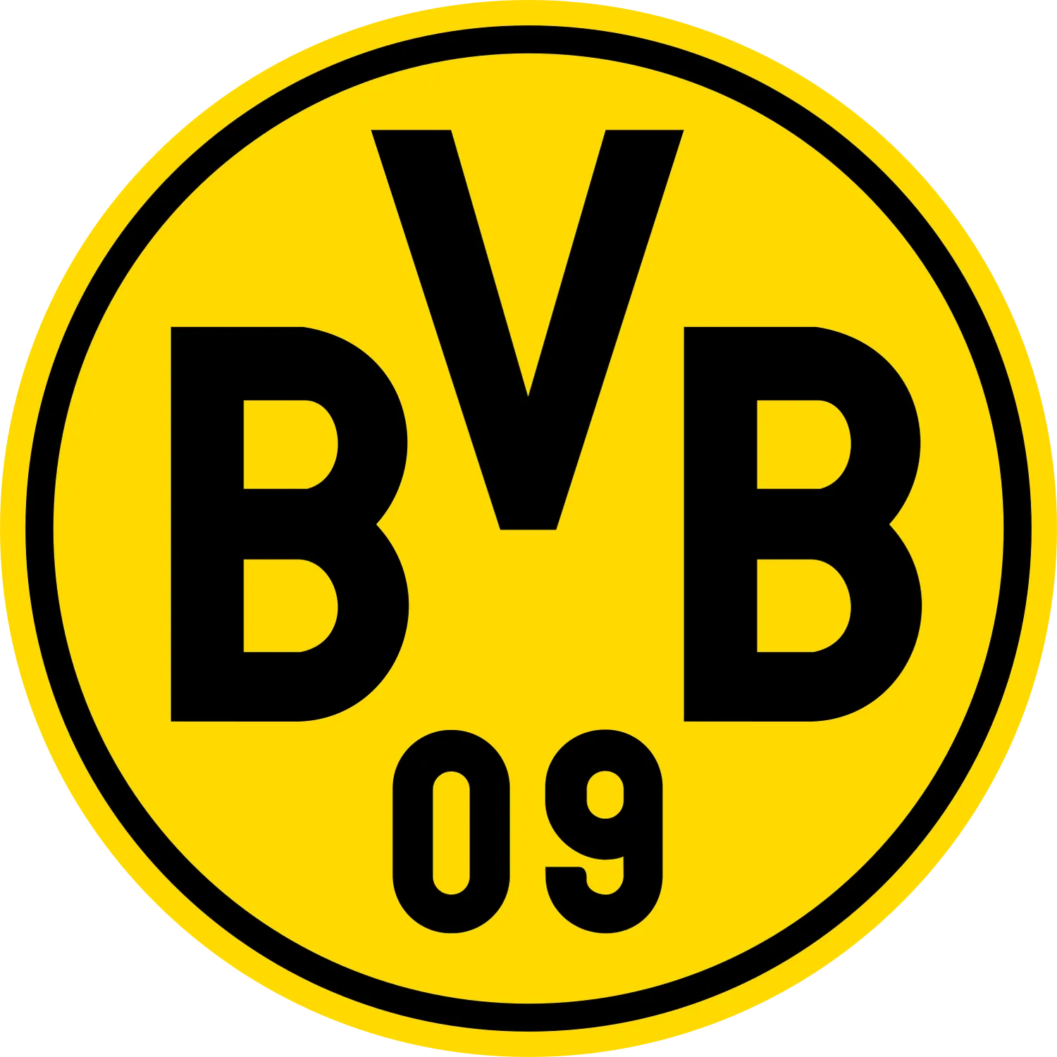


O logotipo do Borussia Dortmund é um dos emblemas mais limpos e instantaneamente reconhecíveis no futebol alemão: um brasão circular amarelo brilhante, contornado em preto, com letras pretas em negrito “BBB” acima do número “09”. Ao contrário de muitos brasões de futebol, ele não usa um animal, um marco da cidade, uma coroa, um escudo ou uma cena heráldica complexa. Seu poder vem da extrema simplicidade: iniciais, ano de fundação e a inconfundível identidade em preto e amarelo do clube.
O emblema atual reflete a cultura direta do futebol da classe trabalhadora do Borussia Dortmund. É prático, alto e fácil de reconhecer à distância, o que se encaixa perfeitamente no mundo visual do clube: camisas amarelas, detalhes pretos, o Südtribüne e o apelido “Preto e Amarelo”. O site oficial do clube descreve o Dortmund como um clube fundado em 1909 no coração industrial da Alemanha e conhecido mundialmente por suas cores preto e amarelo, ambiente familiar e base de fãs apaixonados.
Hoje, o brasão do BVB 09 é usado em kits de jogos, marcas de estádios, mídias digitais, mercadorias e comunicação internacional de clubes. Seu formato circular e paleta de cores limitada o tornam especialmente eficaz em marcas esportivas modernas: ele funciona claramente em camisas, cachecóis, ícones de aplicativos, avatares de mídias sociais e gráficos de transmissão.
Origens do brasão do Borussia Dortmund
O Borussia Dortmund foi fundado em 19 de dezembro de 1909 por um grupo de jovens em Dortmund. O nome completo do clube é Ballspielverein Borussia 09 e V. Dortmund, geralmente abreviado para BVB ou Borussia Dortmund.
A palavra “Borussia” é o nome latino da Prússia, mas no caso de Dortmund, o nome é comumente associado ao local Cervejaria Borussia, perto de onde os fundadores se conheceram. O clube originalmente jogava com camisas listradas de azul e branco com faixa vermelha e shorts pretos, antes de adotar o preto e o amarelo em 1913.
O primeiro brasão reconhecível no estilo BVB apareceu no início do século XX e estabeleceu a ideia básica que ainda define o logotipo hoje: um emblema circular com as letras BVB e o número 09. O Football Kit Archive lista a história do logotipo do Borussia Dortmund, começando com o brasão de 1913—1919 e depois com a versão “BVB 09" da rodada de 1919—1945, mostrando o quão cedo o clube adotou essa identidade baseada em iniciais.
O que os símbolos no emblema do Borussia Dortmund representam
As letras “BVB”
As letras BVB vêm do nome completo do clube: Ballspielverein Borussia. “Ballspielverein” pode ser traduzido aproximadamente como “clube de jogos de bola” ou “clube para jogos de bola”, enquanto “Borussia” se refere ao nome do clube escolhido na fundação. A abreviatura se tornou tão forte que muitos torcedores ao redor do mundo simplesmente chamam o clube de “BVB”.
Graficamente, as três letras conferem ao emblema toda a sua personalidade. Eles são curtos, ousados e altamente legíveis, tornando o brasão mais parecido com um monograma moderno do que com um brasão de futebol tradicional.
O número “09”
O 09 refere-se a 1909, o ano em que o Borussia Dortmund foi fundado. Essa é uma característica comum na identidade do futebol alemão, onde os anos de fundação geralmente aparecem diretamente nos nomes e emblemas dos clubes.
No brasão de Dortmund, o número fica abaixo das letras e equilibra a composição circular. Também confere ao logotipo um peso histórico sem precisar de elementos decorativos extras.
O círculo amarelo
O fundo amarelo reflete diretamente as famosas cores do clube do Borussia Dortmund. Dortmund é amplamente conhecido como Die Schwarzgelben, o que significa “O preto e o amarelo”, um apelido derivado das cores associadas ao brasão e à identidade do kit do clube.
Do ponto de vista do design, o círculo amarelo é crucial. Ele cria visibilidade imediata e dá ao emblema uma aparência de alta energia, especialmente quando colocado em fundos pretos ou escuros.
O contorno preto e as letras pretas
As letras e a borda pretas oferecem contraste com o campo amarelo. Essa combinação preto-amarelo é o código visual central do Borussia Dortmund: simples, agressivo e legível instantaneamente. É também uma das razões pelas quais o emblema permanece eficaz em tamanhos muito pequenos, onde cristas mais detalhadas podem perder a clareza.
Ausência de heráldica
Um dos fatos mais importantes sobre o logotipo da BVB é o que ele faz não conter. Não há brasão da cidade, mascote animal, símbolo do estádio e figura mitológica. O emblema é quase inteiramente tipográfico, construído em torno do nome, ano e cor. Isso o torna um dos emblemas mais mínimos de grandes clubes do futebol europeu.
Evolução do brasão do Borussia Dortmund
1913—1919 - Identidade precoce em preto e amarelo
A história inicial do logotipo do Borussia Dortmund começa por volta do período em que o clube adotou preto e amarelo como suas cores. O Football Kit Archive registra o brasão de 1913—1919 como o primeiro em sua linha do tempo com o logotipo do Borussia Dortmund.
Esse período é importante porque estabeleceu a base visual em preto e amarelo que ainda define o clube hoje.
1919—1945 — Emblema “BVB 09” da primeira rodada
Em 1919, Dortmund passou para um formato de crachá redondo com “BVB 09” no centro. Essa se tornou a linguagem básica de design do clube: uma marca circular, letras em negrito e uma referência ao ano de fundação.
O emblema já estava se afastando de imagens complicadas e adotando uma identidade direta baseada em iniciais.
1945—1964 — Refinamento do pós-guerra
Após a Segunda Guerra Mundial, o brasão continuou a usar a fórmula BVB 09, com refinamentos no círculo, contornos e letras. O Football Kit Archive lista uma fase distinta de 1945-1964 na história do logotipo do clube.
Esse período ajudou a consolidar o emblema como um símbolo estável do clube, em vez de um gráfico temporário.
1964—1974 — Emblema circular mais limpo
Durante a década de 1960 e início da década de 1970, o brasão do BVB ficou mais limpo e mais próximo da versão moderna. A moldura circular, o campo amarelo e as letras pretas continuaram sendo os elementos essenciais.
Essa também foi a época em que o Borussia Dortmund ganhou maior reconhecimento europeu, inclusive vencendo a Copa dos Vencedores da Copa da Europa de 1966.
1974—1976 — Modernização mais ampla
O emblema de meados da década de 1970 manteve a mesma estrutura do BVB 09, mas ajustou as proporções, a borda e o peso geral do gráfico. Fontes da história do logotipo identificam isso como uma versão transitória de curta duração antes de um experimento mais incomum.
1976—1978 — brasão da era do patrocinador Lion-Head
Entre 1976 e 1978, o Borussia Dortmund usou um dos brasões mais incomuns de sua história: um distintivo com cabeça de leão. Essa versão é comumente ligada à era de patrocinadores do clube com a Samson, uma empresa de tabaco, e se destaca porque rompeu com a identidade consistente do BVB 09.
Por ter sido uma grande mudança, esse brasão é frequentemente tratado como uma curiosidade na história do logotipo de Dortmund, em vez de uma parte essencial da marca de longo prazo.
1978—1993 — Retorno à fórmula do BVB 09
Após o experimento com a cabeça de leão, Dortmund retornou ao emblema circular mais familiar do BVB 09. O Football Kit Archive lista uma fase de 1978-1993 antes da versão atual.
Esse retorno reforçou a força do conceito original: letras pretas, círculo amarelo, ano de fundação.
1993—presente — Crista simplificada atual
Desde 1993, o Borussia Dortmund usa a versão moderna do brasão: um emblema circular amarelo com contorno preto, BVB letras e 09 abaixo. O Football Kit Archive lista essa versão como o logotipo do clube “desde 1993”.
O logotipo atual quase não precisou ser alterado porque já é extremamente escalável, legível e memorável. Seu minimalismo funciona naturalmente para uma marca moderna sem perder a identidade histórica do clube.
Cores e tipografia
O logotipo do Borussia Dortmund é dominado por duas cores: amarelo e preto. Essas não são opções decorativas; elas são a base do apelido, da identidade do kit e da cultura de torcedores do clube. O clube é conhecido mundialmente por suas cores preto e amarelo e pelo apelido Die Schwarzgelben se traduz diretamente para “The Black and Yellows”.
O fundo amarelo dá brilho à crista e visibilidade instantânea. Também se conecta naturalmente às famosas camisas caseiras de Dortmund e à imagem visual da Muralha Amarela no Signal Iduna Park.
A tipografia preta é pesada, compacta e funcional. As letras não são ornamentadas nem decorativas; elas foram projetadas para serem lidas rapidamente. Isso confere ao brasão uma forte qualidade tipográfica, mais próxima de um monograma esportivo do que de um emblema heráldico. A simplicidade faz parte da força do logotipo: mesmo sem símbolos extras, os torcedores podem identificar imediatamente o clube por meio da marca BVB 09.
Curiosidades relacionadas ao logotipo para fãs
- BVB não é uma letra aleatória. Significa Ballspielverein Borussia, retirado do nome completo do clube, Ballspielverein Borussia 09 e. V. Dortmund.
- O “09” significa 1909. Refere-se ao ano em que o Borussia Dortmund foi fundado, não a um número de equipe ou referência de competição.
- O clube originalmente não usava preto e amarelo. O Dortmund jogou pela primeira vez com camisas listradas de azul e branco com faixa vermelha e shorts pretos, antes de adotar o preto e o amarelo em 1913.
- O brasão é excepcionalmente minimalista para um grande clube europeu. Ele contém apenas letras, números, um círculo e as cores do clube, sem nenhum animal, escudo, coroa ou marco da cidade.
- O logotipo da cabeça de leão foi uma exceção rara. De 1976 a 1978, Dortmund usou brevemente um brasão de cabeça de leão ligado à era do patrocinador de Samson, tornando-o um dos emblemas mais incomuns da história do BVB.
- O logotipo atual data de 1993. O moderno brasão circular BVB 09 permaneceu em uso desde então, com sua clareza tornando grandes reformulações desnecessárias.
- O distintivo corresponde ao apelido do clube. O Borussia Dortmund é conhecido como Die Schwarzgelben, “The Black and Yellows”, por causa das cores que dominam tanto o brasão quanto a identidade do kit.
O logotipo do Borussia Dortmund prova que um brasão de futebol não precisa de um simbolismo complexo para se tornar icônico. Seu significado é construído a partir do essencial: BVB, 09, preto, amarelo e uma moldura circular. Juntos, esses elementos comunicam o nome do clube, o ano de fundação, a identidade e a atmosfera com notável eficiência.
Para fãs e designers, o emblema BVB é um modelo do minimalismo do logotipo do futebol. É histórico sem ser antiquado, ousado sem ser exagerado e conectado instantaneamente a uma das identidades coloridas mais fortes do futebol mundial.
--
Sobre o Borussia Dortmund — O Borussia Dortmund é um clube de futebol profissional da Alemanha que compete na Bundesliga. Esta página fornece o brasão principal e o ícone de mídia social (SVG e PNG) com fundos transparentes para uso editorial/de referência. Para saber as regras oficiais da marca, consulte o site oficial do clube. O brasão do Borussia Dortmund e as marcas relacionadas são marcas registradas de seus respectivos proprietários; arquivos de logotipo de alta qualidade são fornecidos acima nesta página.


