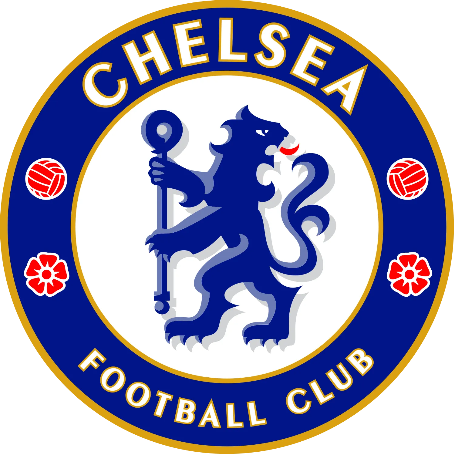


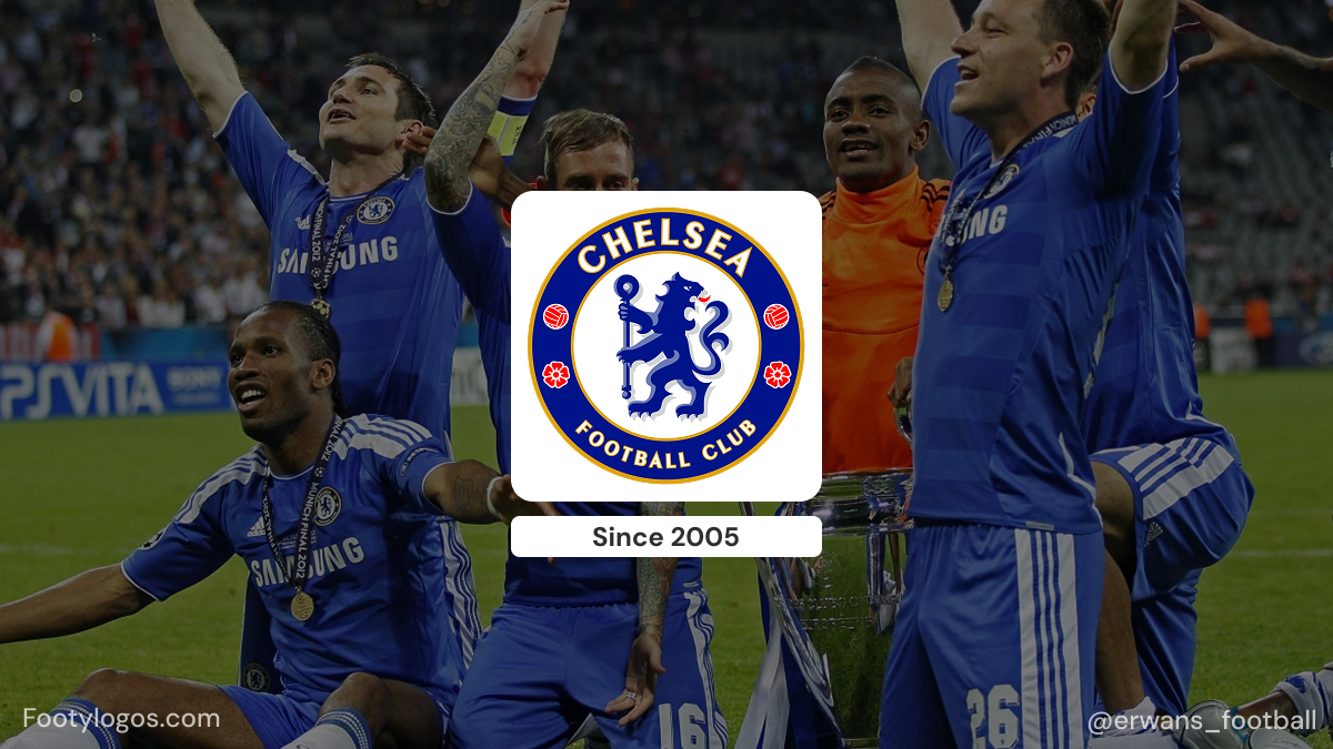
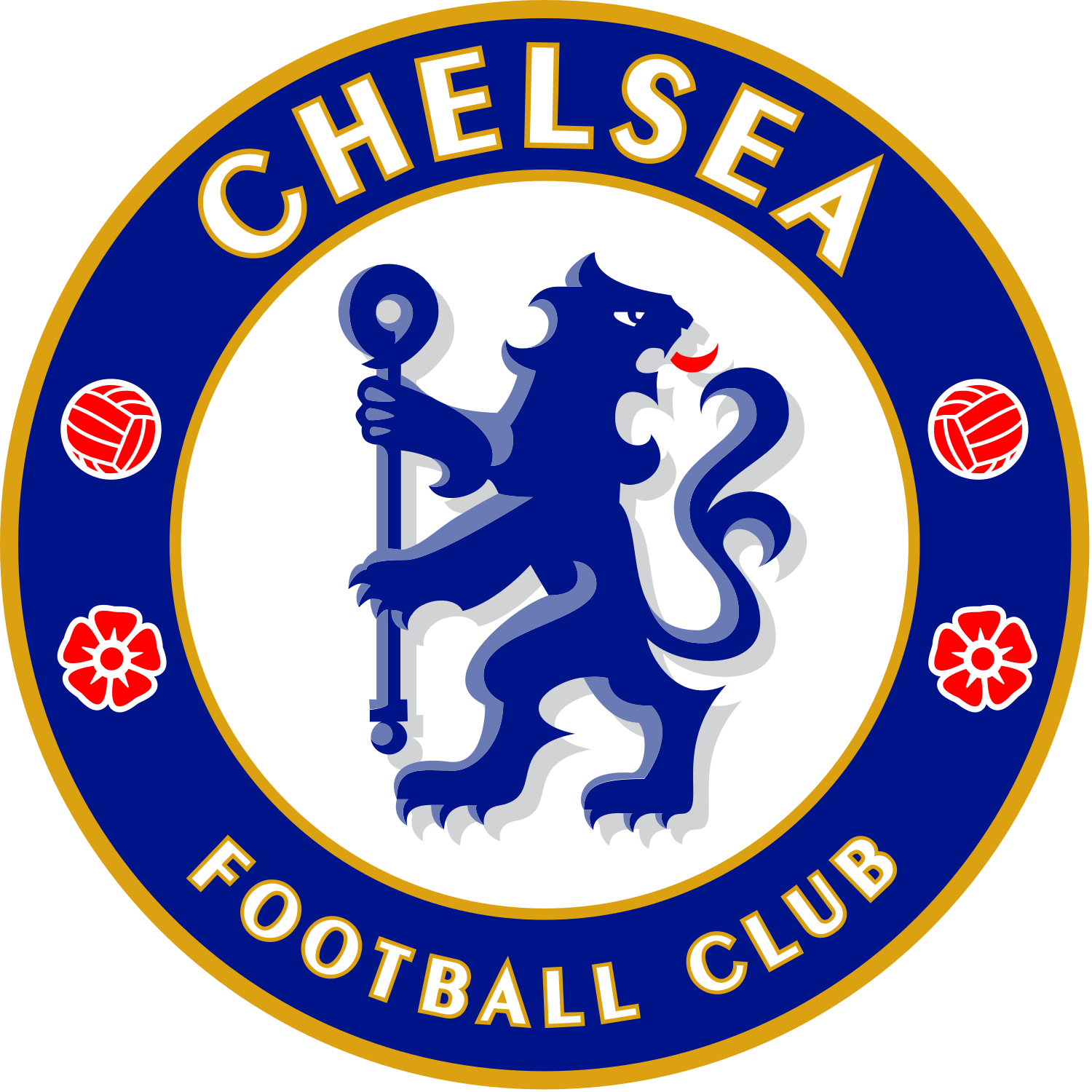
The Chelsea logo is built around a blue heraldic lion standing upright and looking backwards, holding a staff, placed inside a blue circular ring that reads CHELSEA FOOTBALL CLUB. Around the lion sit two red roses and two footballs, with small decorative marks that help balance the composition. It is one of the most recognisable badges in English football, instantly linked with royal blue shirts, Stamford Bridge and the club’s modern identity as “The Blues”.
Although it looks like a modern sports logo, the crest is deeply rooted in local heraldry. The lion and staff are adapted from historic coats of arms connected to Chelsea and its former club presidents, while the roses and circular layout give the badge a distinctly English, almost traditional feel. The current version, introduced in 2005 for the club’s centenary, is a refined return to the classic lion crest first used in the 1950s, updated to work cleanly on shirts, merchandise and digital media.
Origins of the Chelsea crest
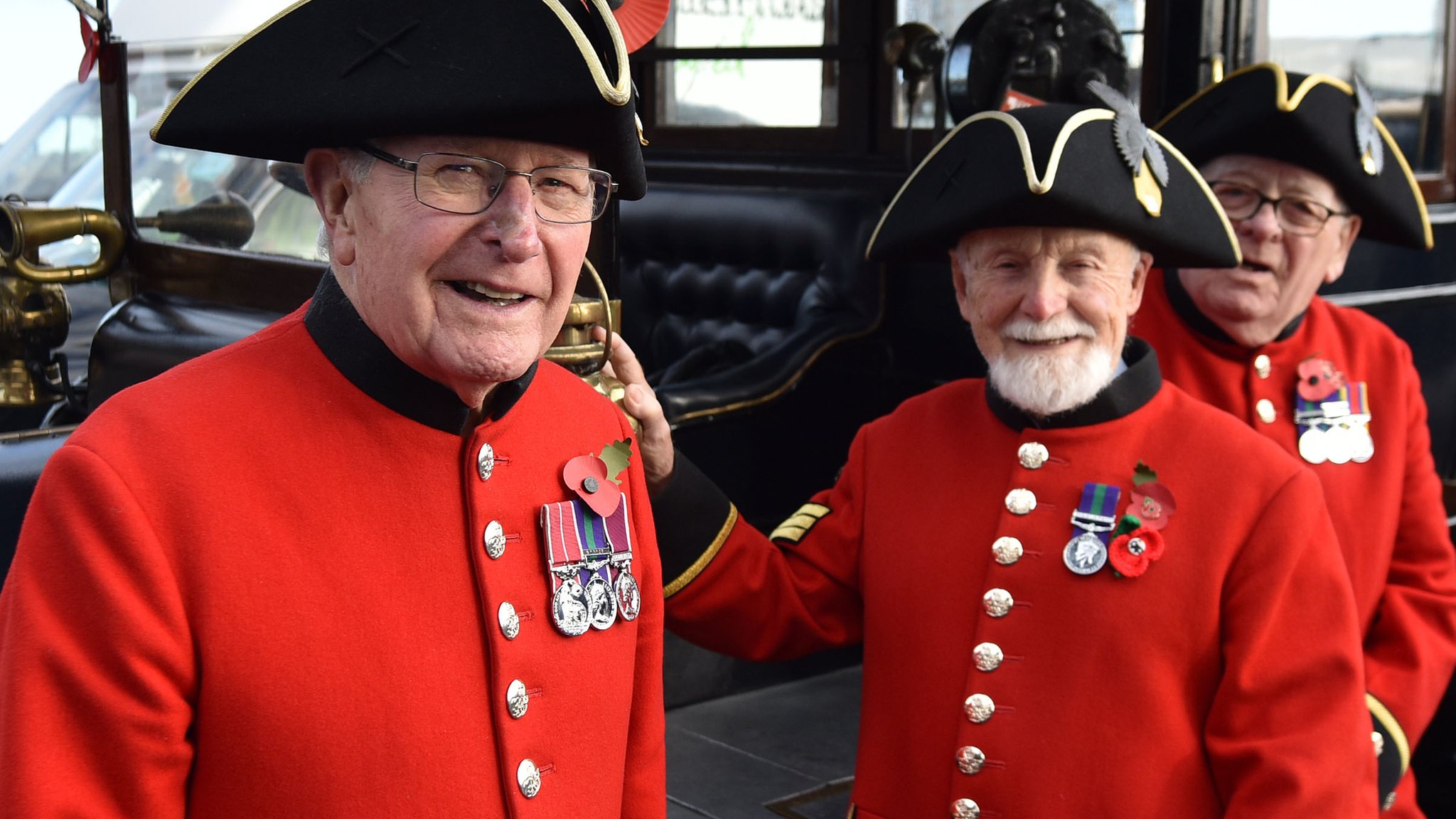
When Chelsea were founded in 1905, their first emblem wasn’t a lion at all, but a Chelsea Pensioner – the iconic army veteran from the nearby Royal Hospital Chelsea. The early crest showed a detailed portrait of a pensioner, sometimes inside a circular frame with “Chelsea Football Club” around the edge. This image gave the club its original nickname, “The Pensioners”, and remained associated with Chelsea for roughly half a century, though it did not regularly appear on players’ shirts.
By the early 1950s, manager Ted Drake wanted to modernise the club’s image. He saw the pensioner badge as old-fashioned and pushed for a more dynamic symbol. As an interim step in 1952, Chelsea adopted a minimalist “cipher” crest showing only the initials C.F.C., which appeared on some materials while a long-term replacement was being prepared.
The transformation came in 1953, when Chelsea unveiled a completely new badge: a blue lion rampant regardant holding a staff, surrounded by a circular border, roses and footballs. This design brought together heraldic motifs from local coats of arms and finally created a crest that looked both modern and distinctly tied to the club’s home borough. It would go on to appear on match shirts from the early 1960s and become the central image of Chelsea’s identity for decades.
Why Chelsea are called “The Blues”
Chelsea’s main nickname, “The Blues”, is directly linked to the club’s colours and, by extension, its badge.
From the early years, Chelsea played in blue, originally a lighter “Eton blue” inspired by the colours of the club’s president, before switching to a deeper royal blue around 1912. Over time, this royal blue became so strongly associated with the club that it naturally produced the nickname “The Blues”. Later kit changes in the 1960s, when Chelsea adopted an all-blue shirt-and-shorts combination with white socks, strengthened this visual identity.

The lion on the crest is also rendered in blue, reinforcing that connection between nickname, kit and logo. In other words, the badge doesn’t just sit on a royal blue shirt: it embodies the colour that defines the club.
What the symbols on the Chelsea badge represent
The Chelsea crest is packed with carefully chosen symbols. Only elements with well-documented meanings are listed here.
- Blue lion rampant regardant
- The lion is a heraldic “lion rampant regardant” – standing upright and looking back over its shoulder.
- This figure is taken from the arms of Viscount Chelsea / the Earls of Cadogan, who had strong ties to the club and were influential in the area.
- Using this lion links the club to local nobility and gives the badge a regal, authoritative feel.
- The staff (crozier)
- The lion holds a staff or crozier, a stylised shepherd’s crook often associated with ecclesiastical authority.
- This staff is derived from the arms of the Abbots of Westminster, who were historically Lords of the Manor of Chelsea, tying the logo back to the area’s medieval and religious history.
- Red roses
- The crest includes three red roses, positioned around the lion.
- These represent England, echoing the Tudor rose and underlining Chelsea’s identity as an English club despite its modern global profile.
- Football motifs
- Two footballs appear on the badge, balancing the composition and making the sport explicit.
- They serve as a straightforward reminder that, despite all the heraldry and history, Chelsea is first and foremost a football club.
- Circular ring and wording
- The blue ring with CHELSEA FOOTBALL CLUB in white creates a bold, logo-like frame.
- This circular form is typical of mid-20th-century sports badges and makes the crest highly adaptable for shirt patches, merchandise, and broadcast graphics, while still feeling like a traditional emblem.
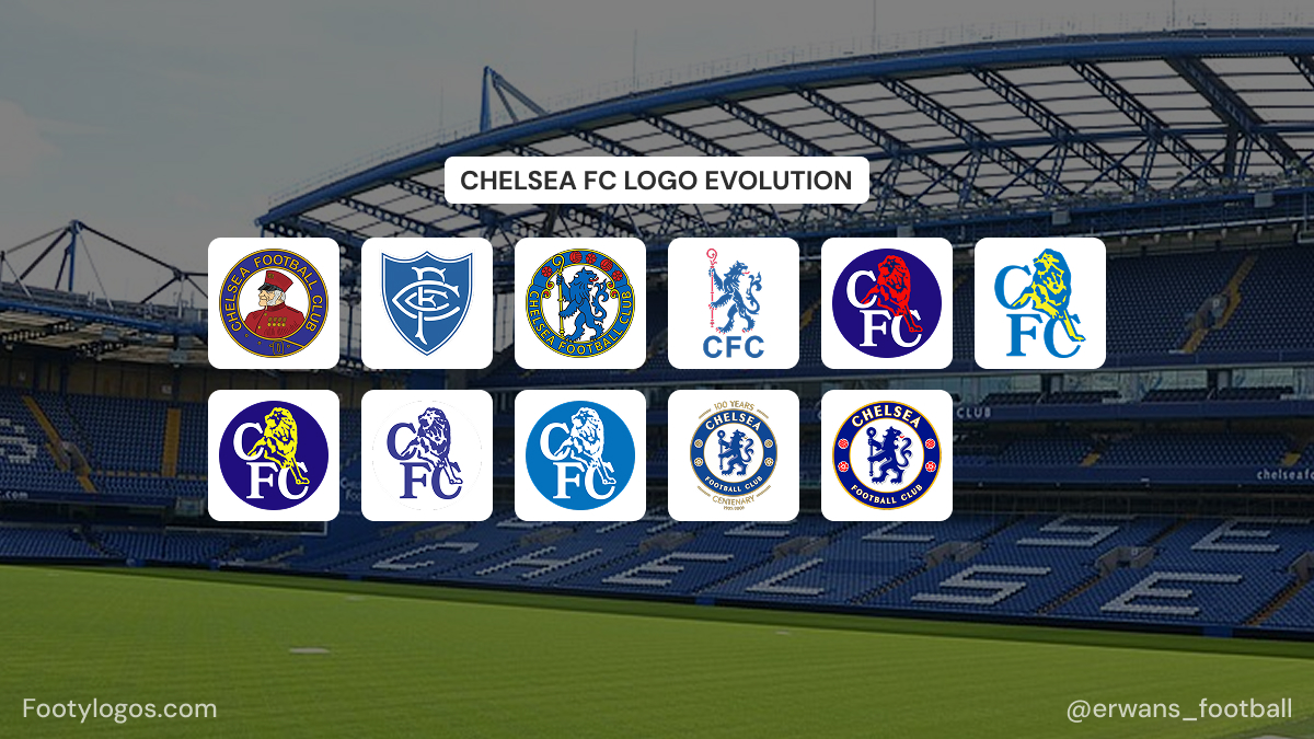
Evolution of the Chelsea crest
Chelsea’s badge history can be broken into a small number of clear eras, each with a distinct look.
.jpg)
- 1905–1952 – The Pensioner era
- The first crest showed a Chelsea Pensioner, honouring the retired soldiers of the Royal Hospital Chelsea.
- This image appeared on club materials and contributed to the “Pensioners” nickname, but it did not become a regular shirt badge.

- 1952–1953 – The C.F.C. cipher
- Under Ted Drake’s modernisation, the old pensioner image was dropped.
- A temporary emblem with just “C.F.C.” initials was used for about a year while a more ambitious redesign was prepared.
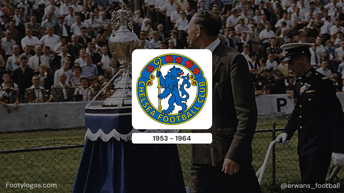
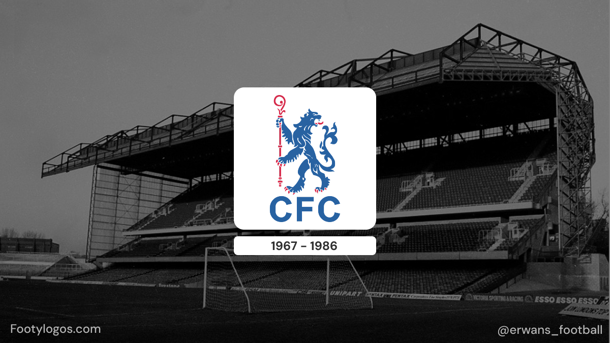
- 1953–1986 – Birth of the lion crest
- En 1953, Chelsea a introduit le célèbre lion rampant regardant bleu tenant un bâton, avec trois roses rouges et deux ballons de football dans un écusson circulaire.
- Cet écusson, combinant l'héraldique municipale et noble, fut le premier à apparaître de manière constante sur les maillots des joueurs dès le début des années 1960 et a défini l'identité visuelle de Chelsea pendant plus de trois décennies.
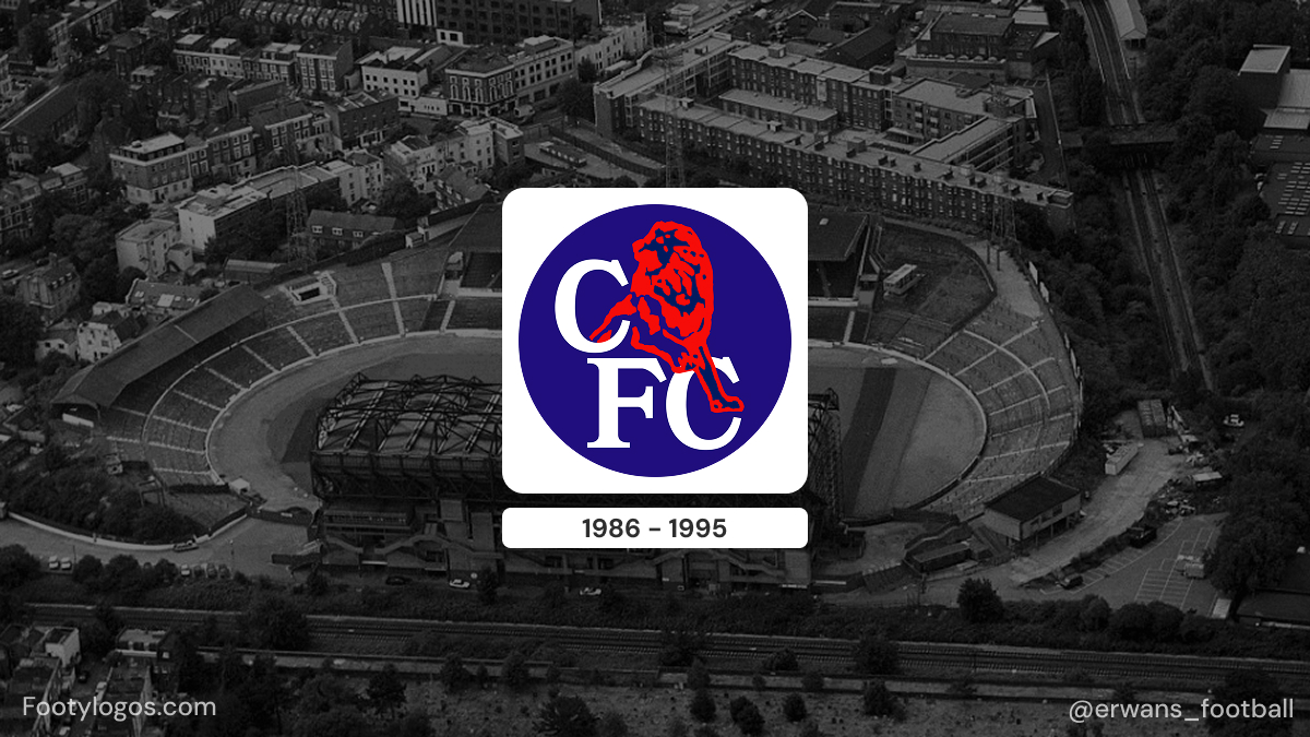
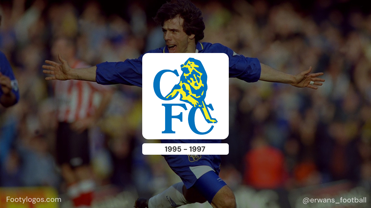
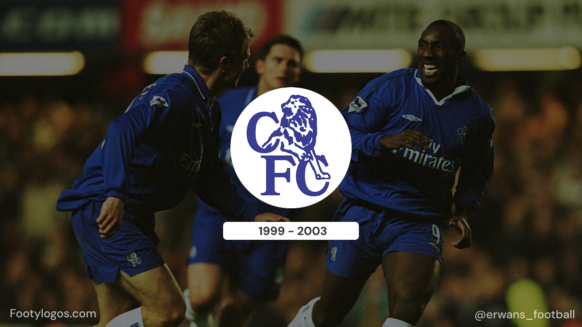
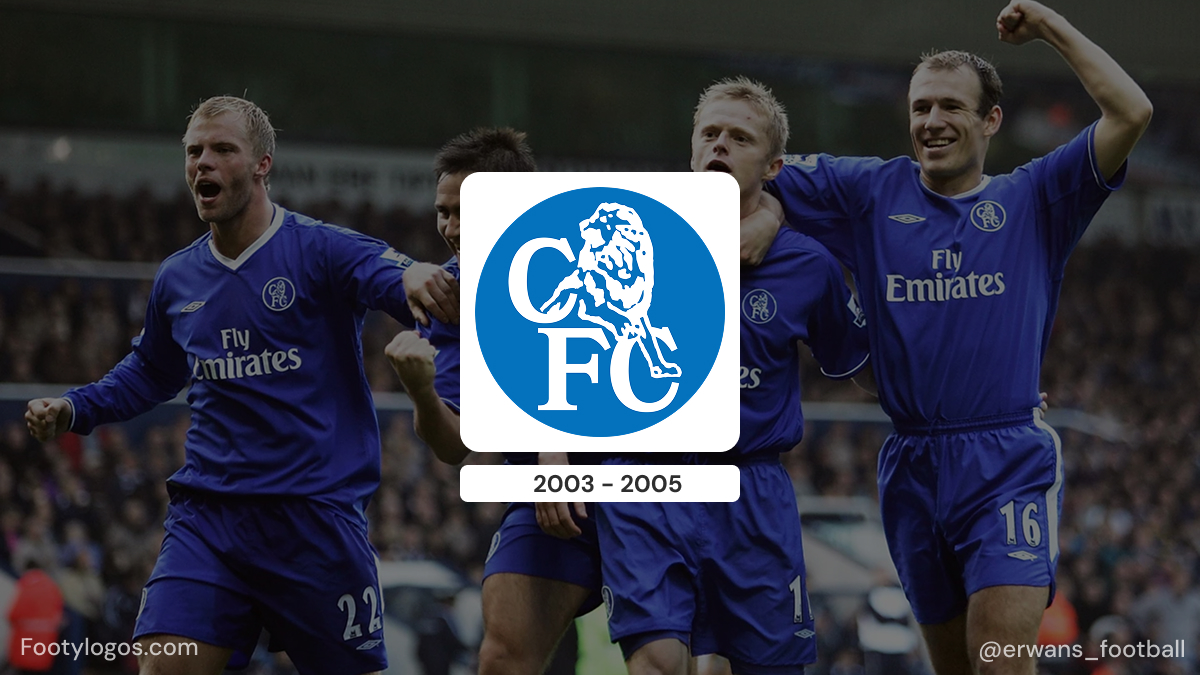
- 1986–2005 – Lion modernisé et initiales CFC
- En 1986, avec Ken Bates comme propriétaire, l'écusson a été redessiné. L'objectif était en partie la modernisation et en partie de créer un écusson qui pourrait être facilement protégé par le droit d'auteur.
- Le nouveau logo montrait un lion plus naturaliste se tenant au-dessus de grandes initiales « CFC », avec plusieurs retouches de couleur au fil des ans (y compris des variantes rouges et jaunes) mais un aspect généralement plus institutionnel et simplifié par rapport à l'écusson héraldique de 1953.
.jpg)
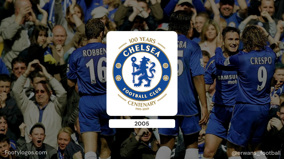
- 2005–aujourd'hui – Retour au lion classique
- À l'approche du centenaire et en réponse à la pression des fans, Chelsea a décidé en 2005 de revenir à un design s'inspirant fortement du blason au lion de 1953.
- Le blason du centenaire, utilisé lors de la saison 2005-2006, a ajouté les mentions « 100 YEARS » et « CENTENARY 2005–2006 » sur son pourtour. Après cette saison, les inscriptions ont été retirées, laissant la version moderne du blason qui est encore utilisée aujourd'hui.
À travers toutes ces époques, un élément est devenu permanent : le lion. Même lorsque la disposition et les inscriptions ont changé, le lion est resté l'ancre de l'identité visuelle de Chelsea.
Couleurs et typographie
La palette de couleurs du blason de Chelsea reflète celle du maillot du club :
- Le bleu roi est la couleur dominante, utilisée pour le lion et la bordure circulaire. Elle correspond aux célèbres maillots domicile et est à l'origine du surnom « Les Blues ».
- Le blanc est utilisé pour le nom du club autour du cercle, garantissant qu'il se détache clairement sur le bleu.
- Rouge et jaune/or apparaissent comme couleurs d'accent : le rouge pour les roses et certaines parties des détails du lion, et le jaune/or pour les contours et les éléments décoratifs, ajoutant chaleur et contraste.
Le logotype CHELSEA FOOTBALL CLUB est défini dans un style simple, gras, sans empattement et en majuscules, suivant la courbe de l'anneau circulaire. Il n'est pas présenté comme une police de caractères commerciale spécifique ; il se comporte plutôt comme un lettrage sportif personnalisé et fonctionnel, conçu pour une lisibilité maximale sur tissu et à distance. La combinaison d'un lettrage géométrique fort et d'un lion héraldique traditionnel confère au blason un équilibre entre clarté de logo moderne et héritage classique du club.
Anecdotes sur le logo pour les fans
- Des « Pensioners » aux « Blues » – Le blason et le surnom originaux des « Pensioners » ont été délibérément abandonnés sous Ted Drake, qui les jugeait dépassés. À mesure que l'identité du maillot bleu royal se renforçait, les « Blues » ont effectivement remplacé les « Pensioners » comme surnom et se reflètent désormais à la fois dans le maillot et dans la couleur du lion.
- Premier blason sur les maillots – Le blason du lion de 1953 a été le premier blason de Chelsea à apparaître régulièrement sur les maillots de match, à partir du début des années 1960. Les emblèmes précédents des « Pensioners » figuraient principalement sur les programmes et les documents imprimés plutôt que sur les équipements.
- Approbation héraldique – Dans les années 1970, une version du blason du lion et du bâton a été accordée comme insigne héraldique pour Chelsea via le Collège des Armes, officialisant le design dans le langage héraldique traditionnel et soulignant à quel point le logo du club est lié à l'héraldique anglaise.
- Droits d'auteur et commerce – La refonte de 1986, avec le lion au-dessus de « CFC », était en partie motivée par des besoins pratiques : le président Ken Bates voulait un blason que le club pourrait déposer comme marque et contrôler plus facilement à une époque où le merchandising footballistique se développait rapidement.
- Nostalgie du centenaire – L'écusson du centenaire de 2005 a été extrêmement populaire auprès des supporters car il restaurait l'aspect héraldique classique. La version post-centenaire a conservé ce style de manière permanente, ce qui signifie que le blason actuel est essentiellement un design des années 1950 modernisé plutôt qu'une invention totalement nouvelle.
Dans l'ensemble, l'évolution du logo de Chelsea montre comment un club peut passer d'un retraité caricatural local à un lion bleu mondial, tout en restant ancré dans l'histoire et l'héraldique du lieu qu'il représente.


